Filter by:
All
News
Events
Awards
Perspectives
Insights
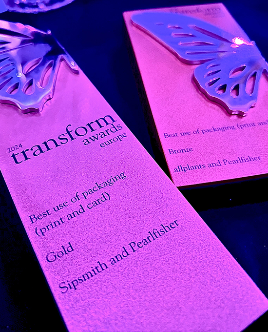
Pearlfisher attends Transform Live Europe Conference and Awards
Pearlfisher London Appoints Chloé Templeman as Executive Creative Director
Pearlfisher appoints its first Global CEO
Pearlfisher London: Calling creatives for Fresh Pearls 2024 Competition
Brand-building for long term business success, the 3-year strategic blueprint for C-Suite.
Building an Iconic Brand in 2024
Futures Feed: Affirmative Aesthetics
Deconstructing Beauty
Digital Possessions
Desirable Undesirables
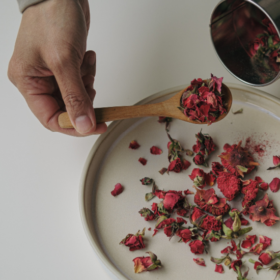
Culinary Biotech
Alternative Tipples
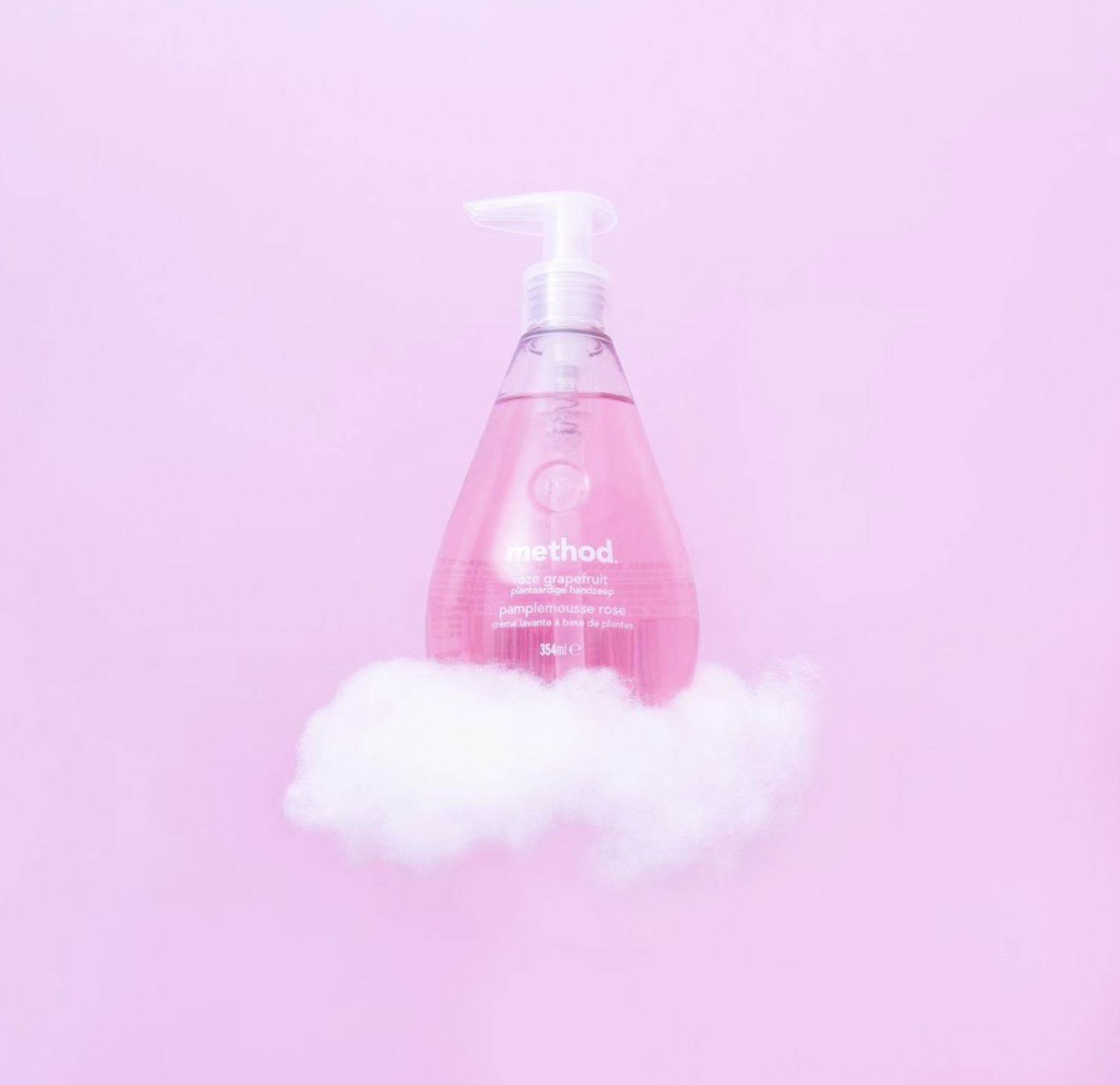
Breaking the Food Mould
Edible Beauty
Food Reformations
Pre-processed Taste
INTIMACY
Cultivating Cannabis
Step Back to Stand Out
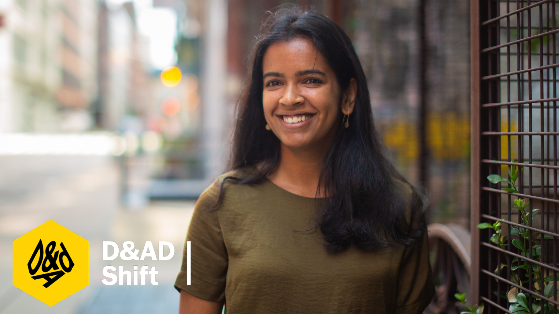
D&AD Shift selects Pearlfisher’s Shruti Shyam as a 2022 Mentor
Pearlfisher earns two GDUSA Packaging Design Awards
The take-outs: Pearlfisher puts Design Intelligence centre stage at #LDF2023
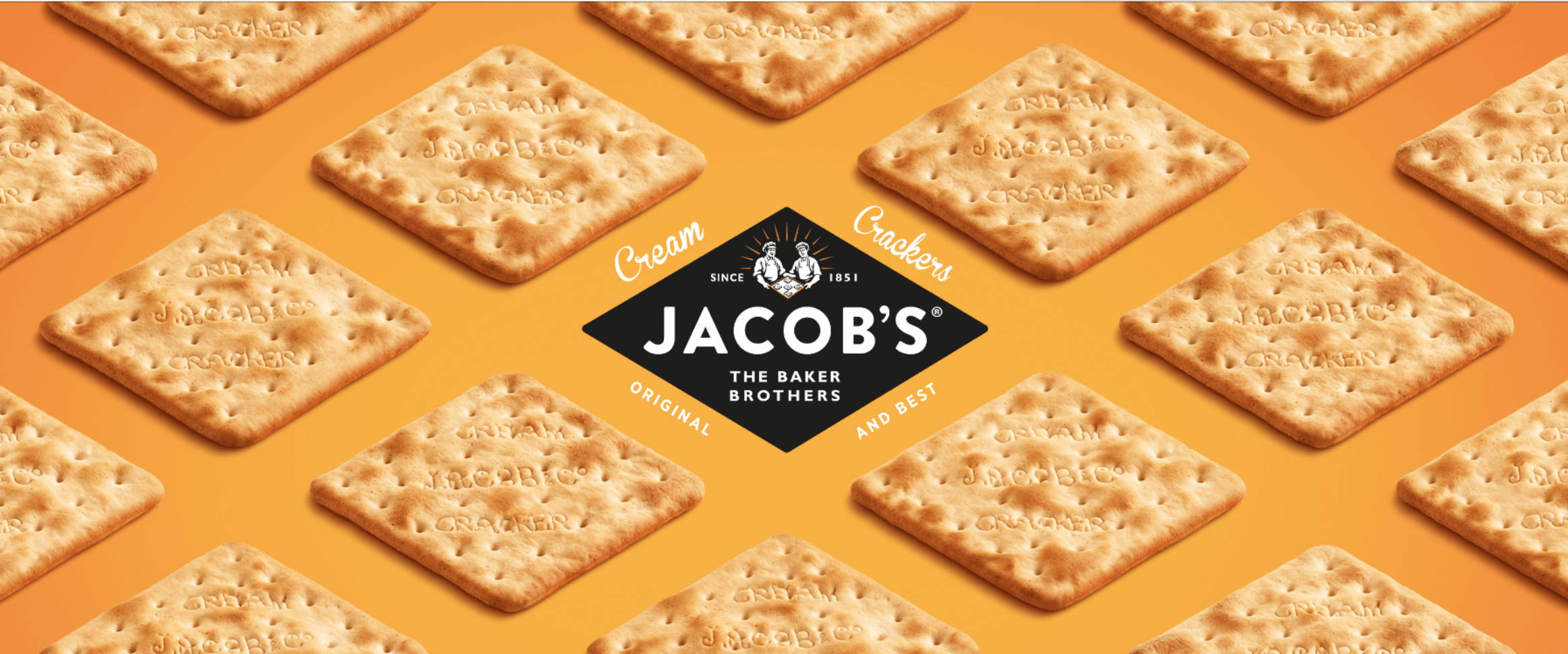
Modern heritage – How to reinvent iconic brands
Hum by Colgate is a finalist at Fast Company’s 2021 Innovation by Design Awards
Don’t throw the baby out with the bathwater: The evolving role of brand icons
Muse by Clio x Pearlfisher | 9 Strategies for Naming a Brand: The icing on the cake
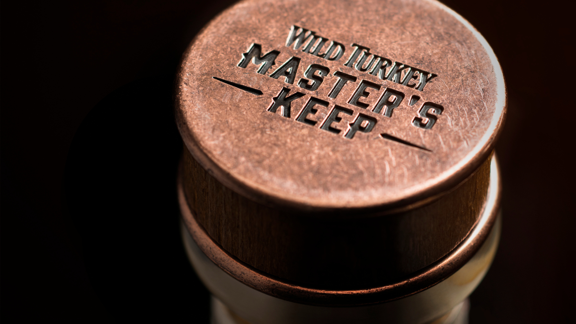
Wagamama and Wild Turkey Masters Keep win at the Pentawards
Creating influence: Designing the future of celebrity and influencer brands
What is premiumisation?
How your brand can leverage blockchain technology to build consumer intimacy
Four creative trends for the future of confectionery
Designing for a Future of Inclusivity
Transform Magazine Feature: What if X marks the spot?
Sustainability is more than materials, but it’s a good place to start.
Life-Centric Brands
So you want to be a lifestyle brand?
Pentawards – Gold Winner 2023
Suzy Shelley to present at Pentawards
Sophie Maxwell’s Article on The Future of Luxury Featured in Fortune
Reshaping societal perceptions
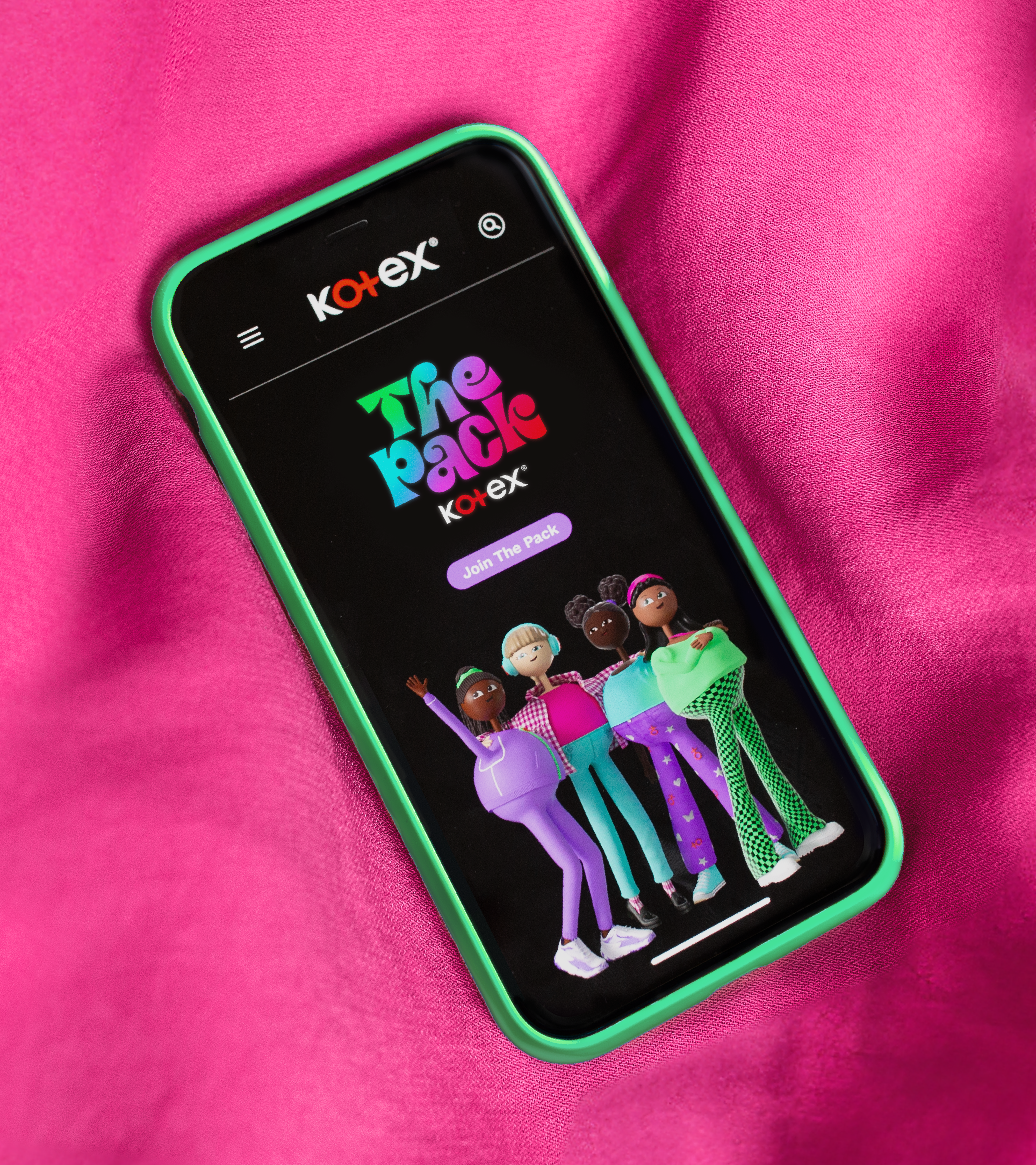
Reimagining menstrual health education
Treasuring story and symbolism
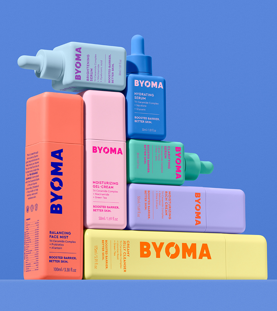
Breaking down beauty barriers
Celebrating iconic simplicity
Recapturing iconic status and equity