On an Eichhof brewery site visit, our design team discovered a wooden table which featured engravings of brewery traditions across almost two centuries. One section of the table was intentionally blank, for new traditions to be added. This inspired the core idea ‘Neue Traditionen’ (New Traditions). Each visual element was then benchmarked against the core idea to imbue the redesign with context and meaning.
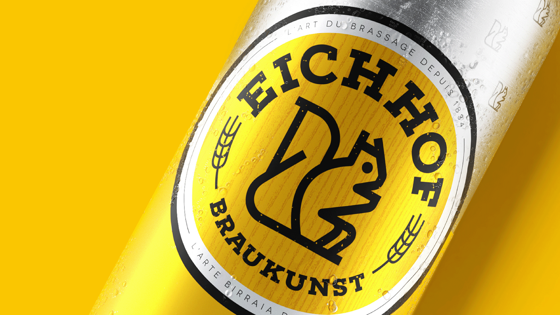
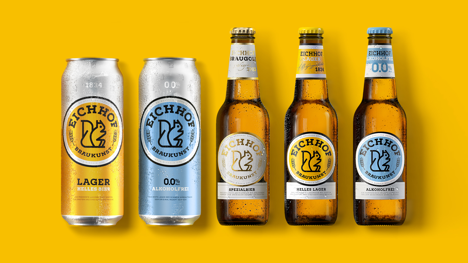
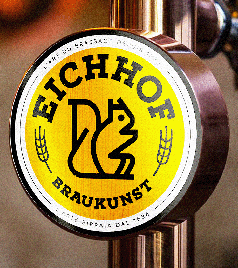
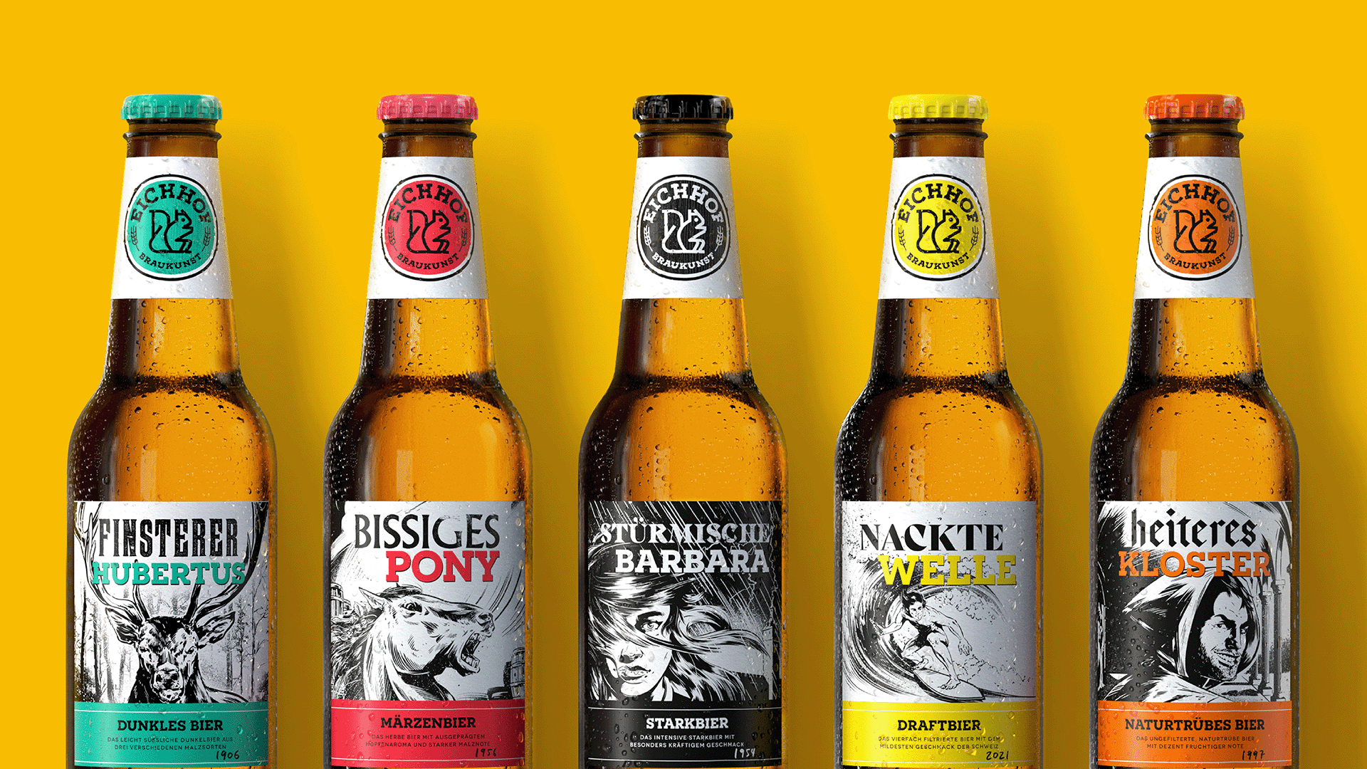
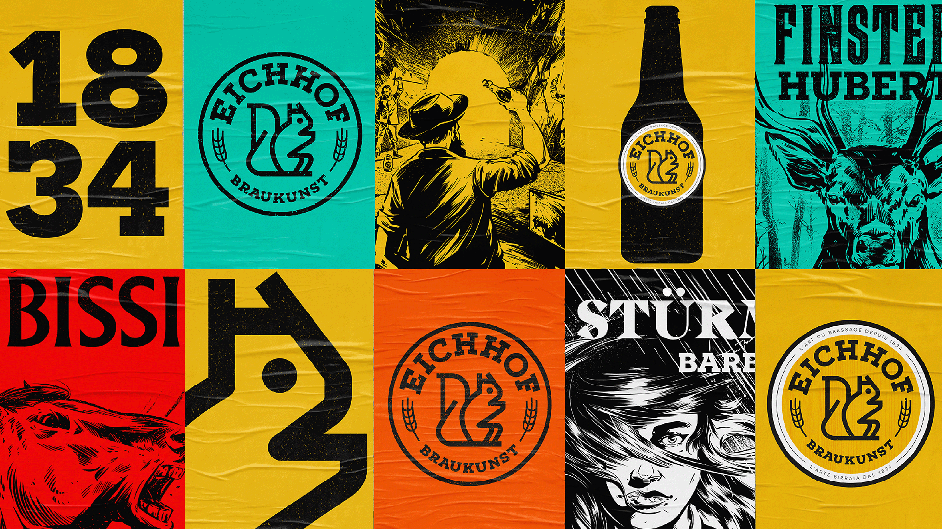
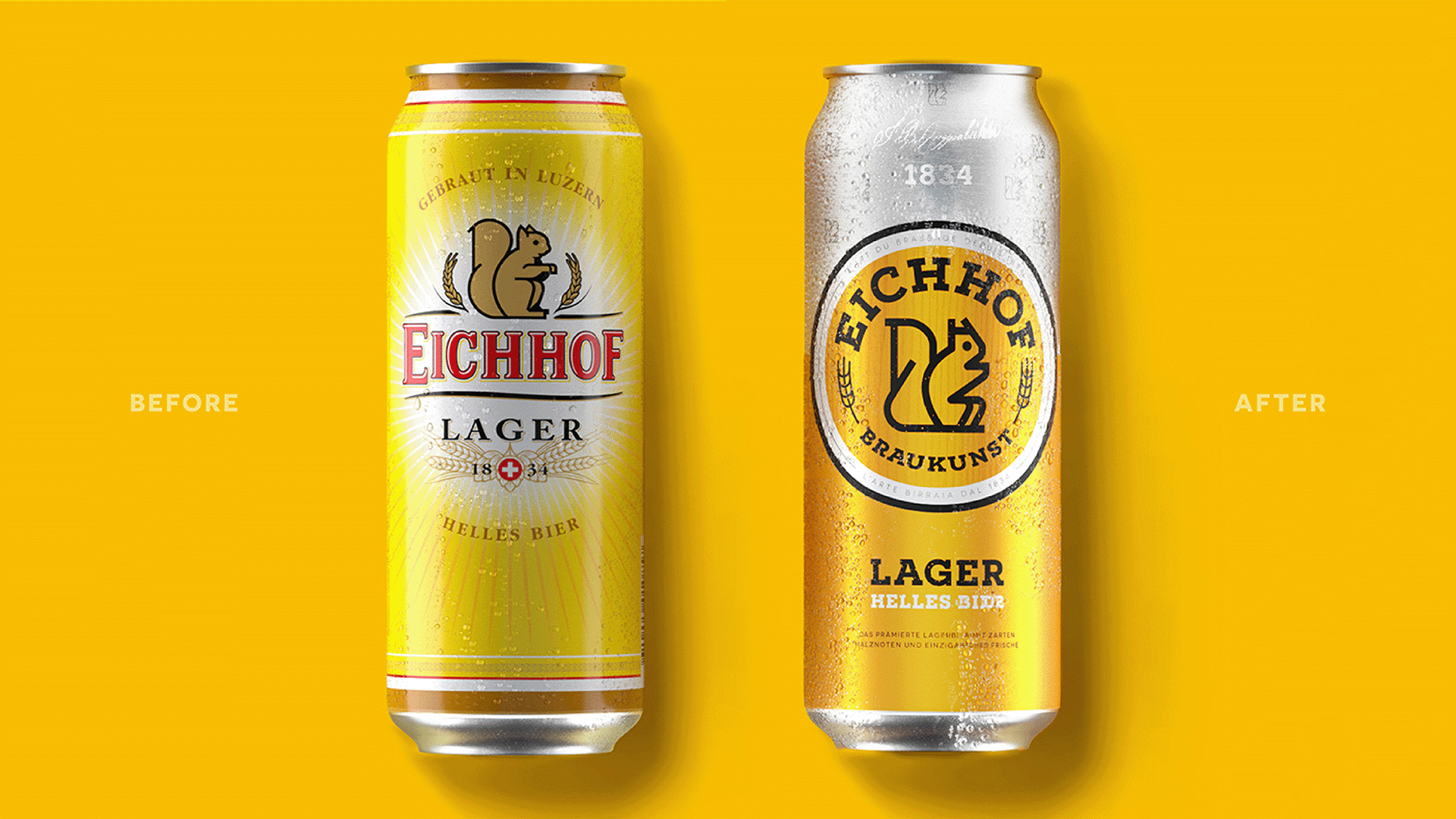
Unchanged since the 1960s and undoubtedly the brand’s most ownable asset, the iconic squirrel was redrawn and now takes pride of place to balance traditional and modern cues. By recreating the wordmark to match the styling of the squirrel and creating a distinctively repetitive squirrel pattern across the Eichhof can, this aspect of the narrative opens up to potential new audiences. New label designs were created for Eichhof’s experimental craft range, each drawing represents the rich history and unique stories connected to the brand and its region.
