Ocean Generation
How do we inspire positive action and mobilise a whole new generation?
Ocean Generation is a charity empowering an inclusive global movement to address ocean threats through science and storytelling and restore a healthy relationship between humanity and the ocean.
Get in touch
The challenge was to create a new visual identity and design that focuses on driving action-oriented change, going beyond merely highlighting the severity of the problem. Instead, the aim was to craft a symbolic and engaging visual narrative that brings the organisation’s mission and message to life.
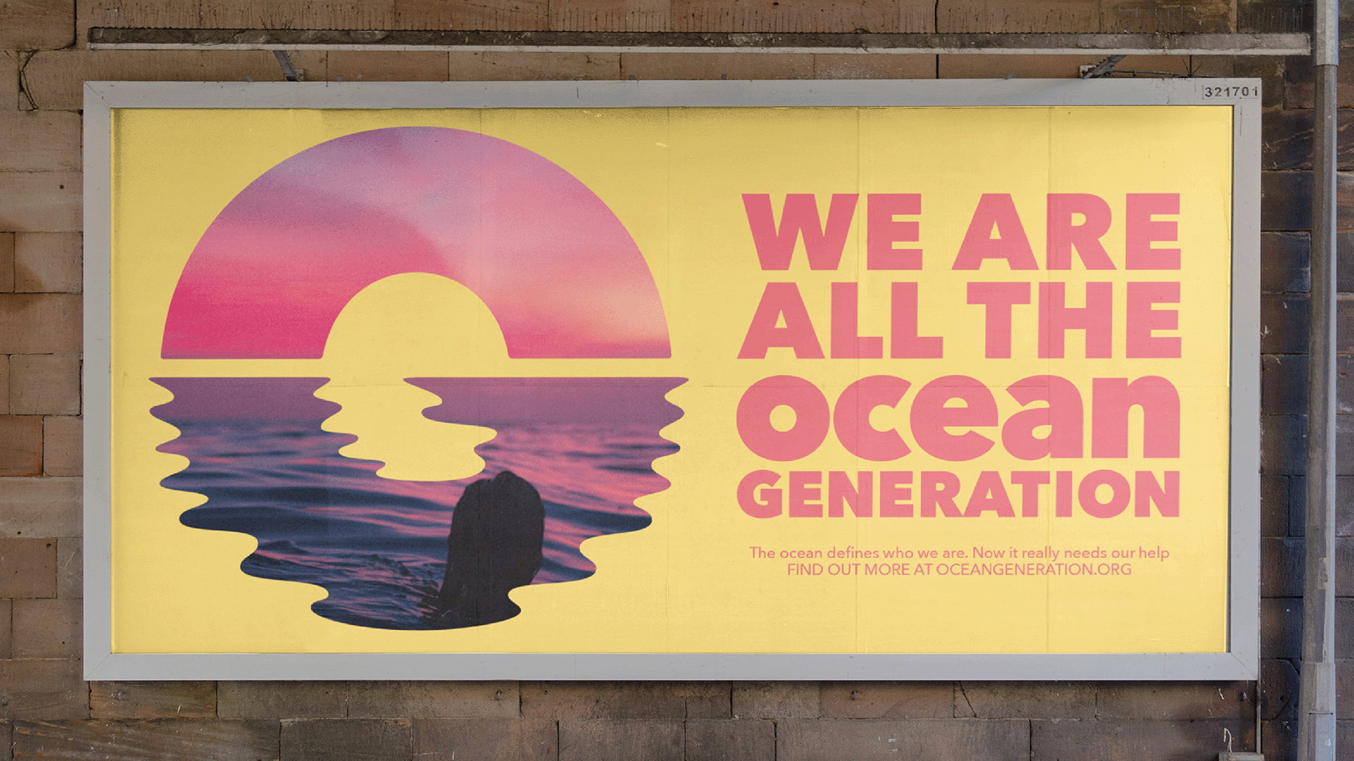
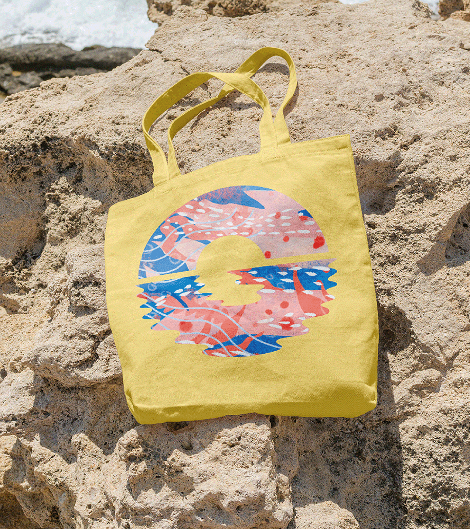
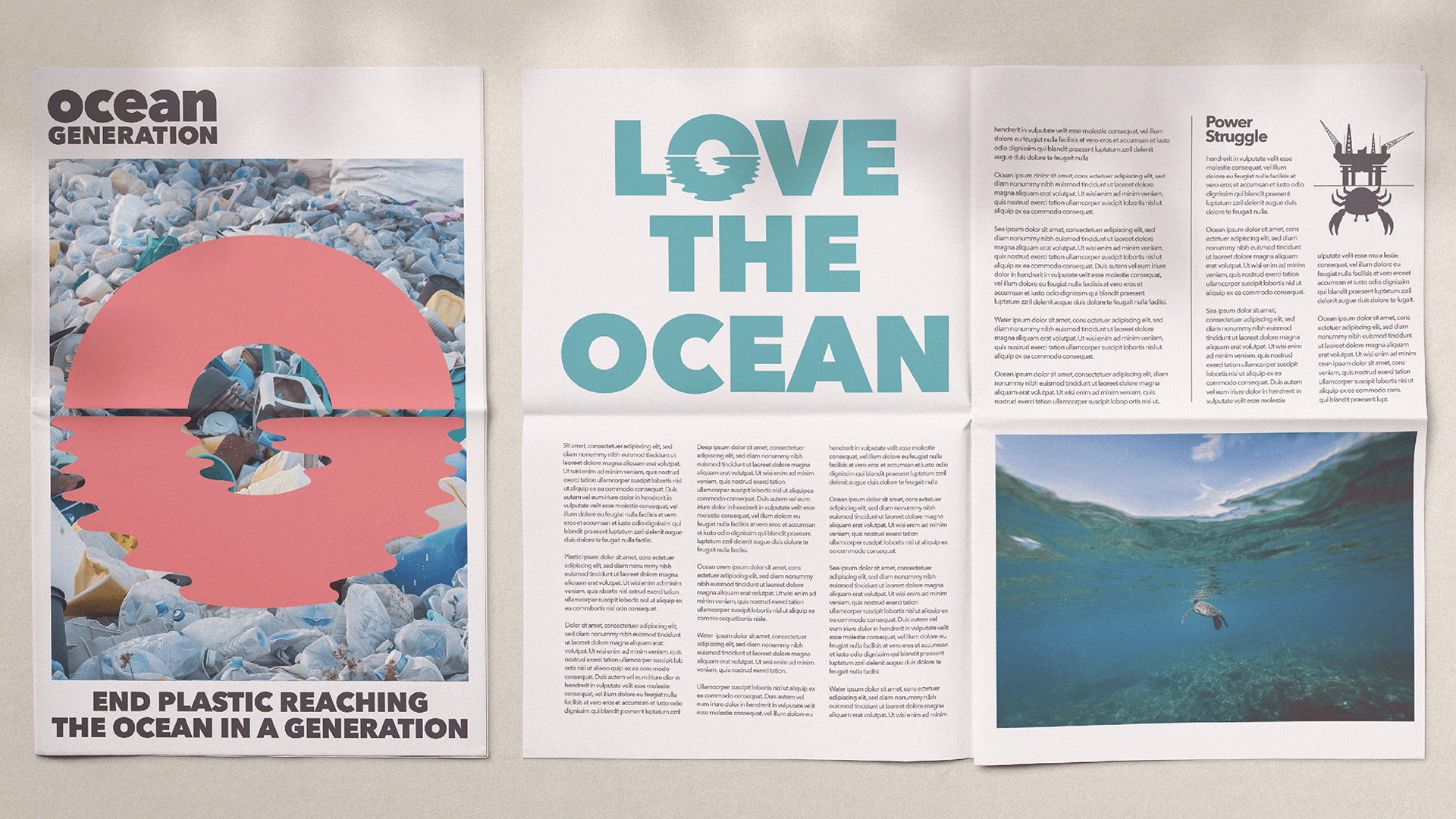
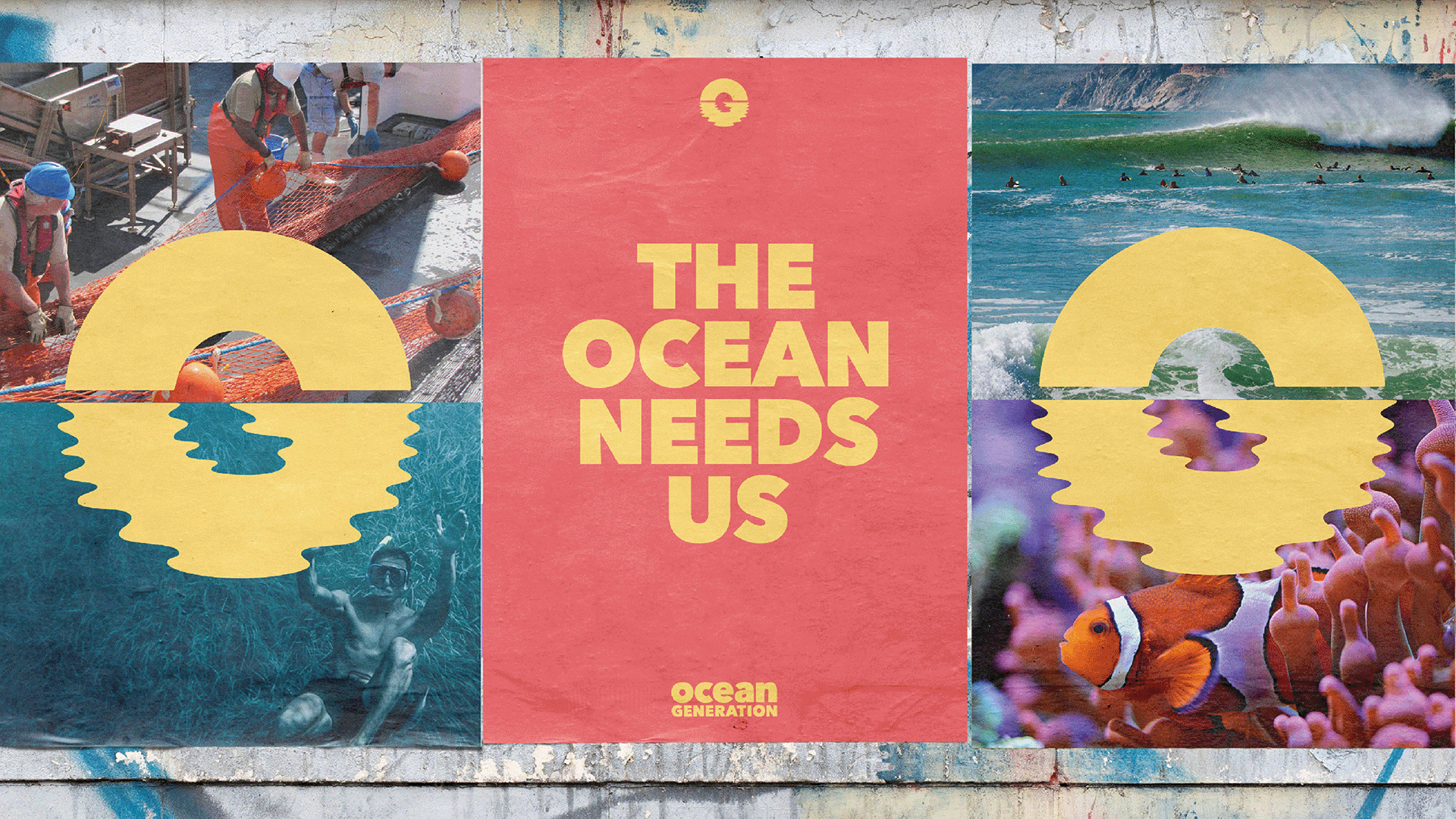
Our team created a logo that initiates the brand’s adaptability. It’s both bold and playful, with the abbreviation of the brand name forming a sunrise symbolising new beginnings. The monogram of the ‘O’ and ‘G’ joins on the horizon, visually linking the land and sea. This division in the core brandmark lends itself to photography, using the identity as a window to help showcase the multi-dimensional nature of the oceans, simultaneously highlighting their beauty and the challenges they face. A complementary, sun-bleached colour palette evokes the myriad hues found in and around the ocean.


Related projects