
A brand redesign that serves up delight at every touchpoint
JoyJolt came to Pearlfisher with a desire to create a more distinctive brand that would stand out and better connect with consumers. JoyJolt was ready to break away from the traditionally muted color palettes and delicate tones of voice so often found in the glassware and kitchenware categories.
Get in touch.
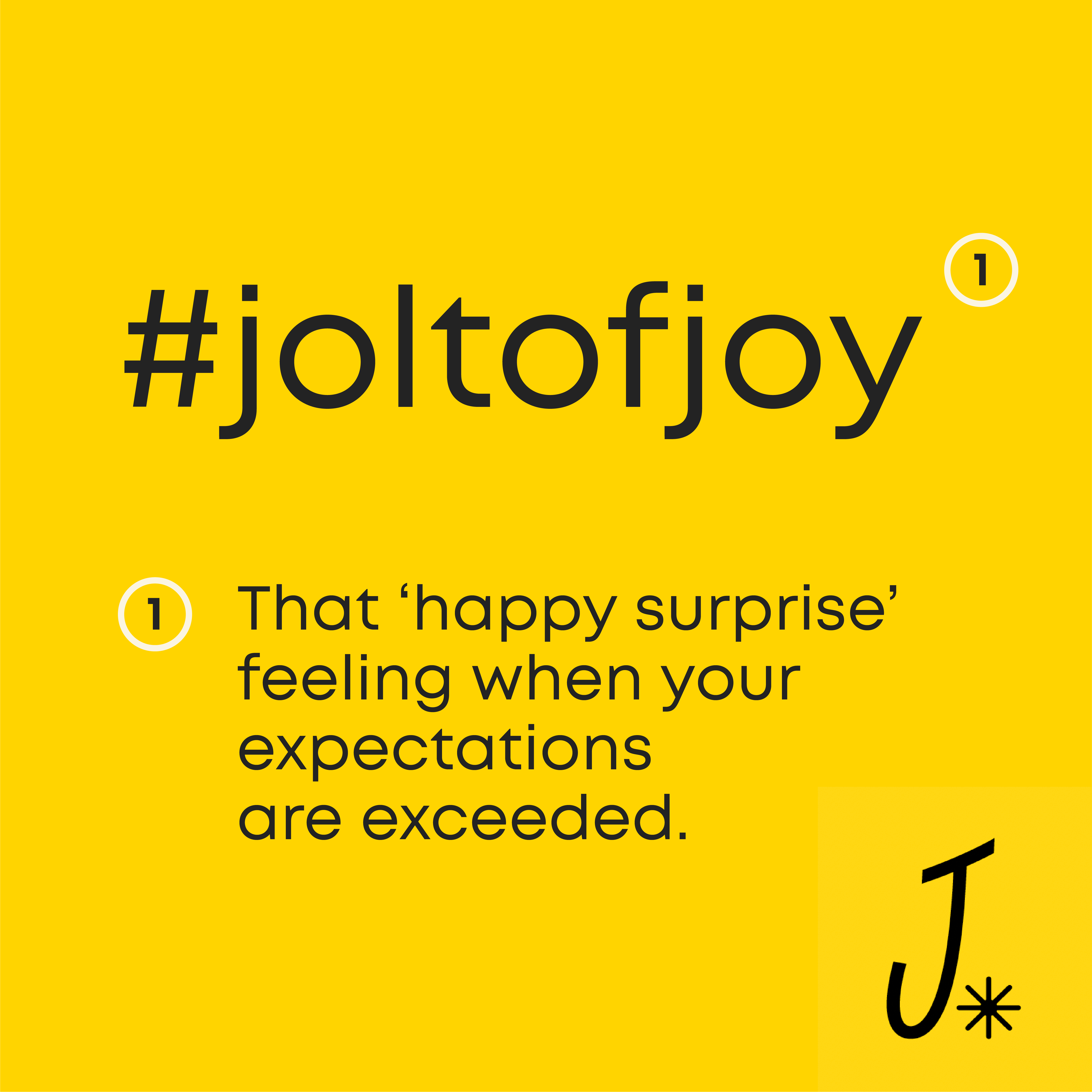
Our strategists began by infusing the name JoyJolt with fresh meaning: the feeling of joy a consumer gets when their expectations for a purchase is exceeded—the happy surprise you feel when you pay less but get higher quality. This tone of voice anchored our brand strategy’s goal to showcase the ways in which JoyJolt is uniquely positioned to fill the gap between price and quality.

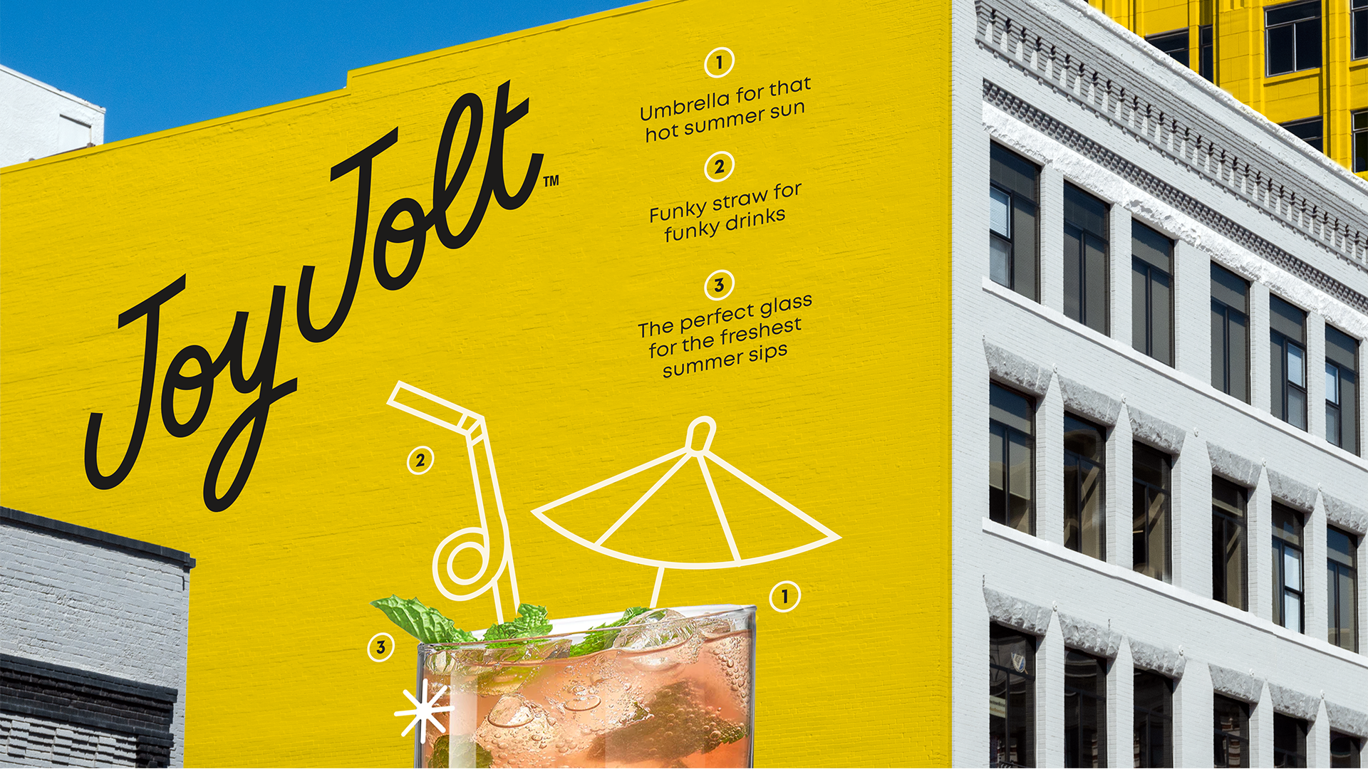
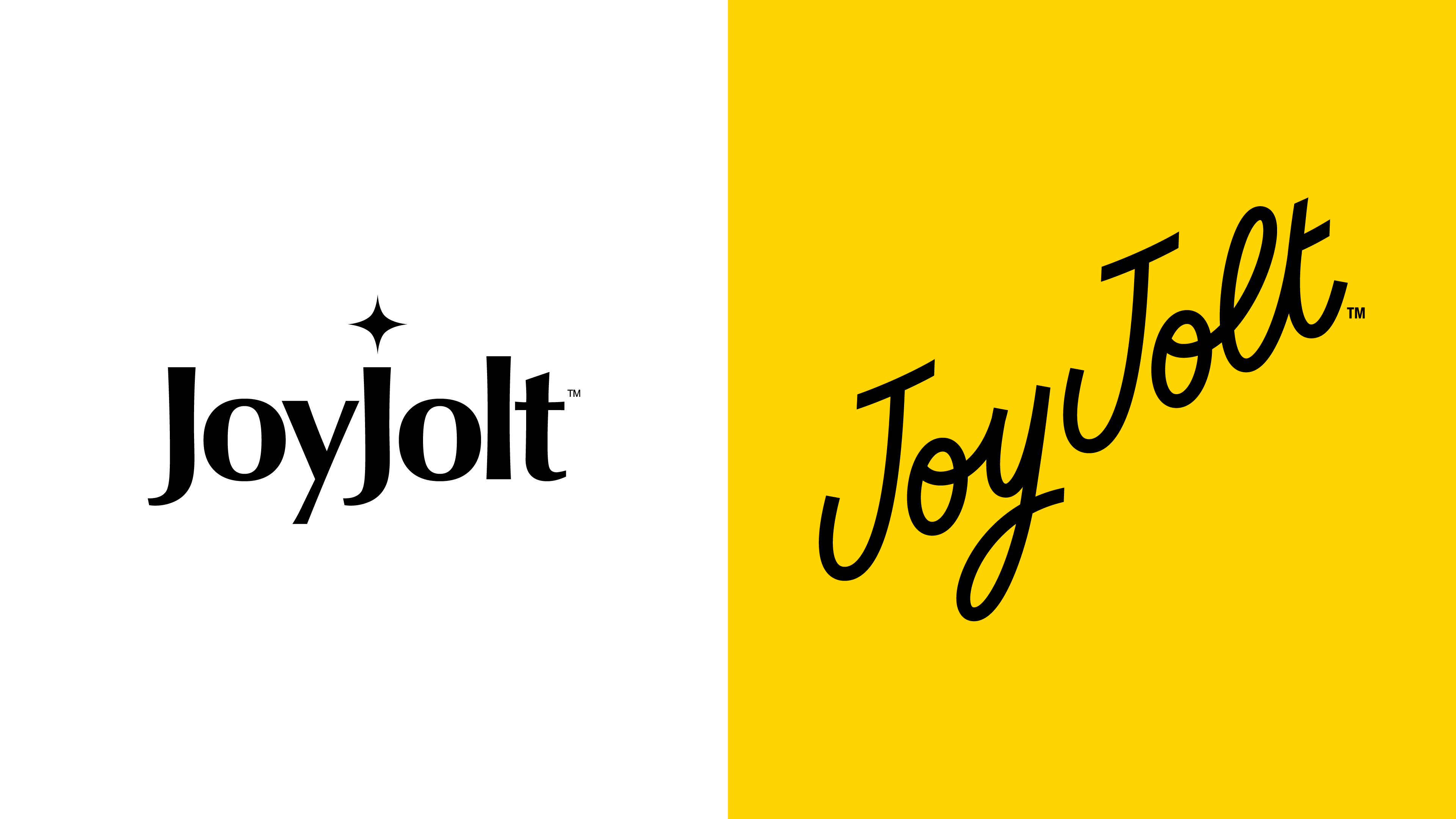
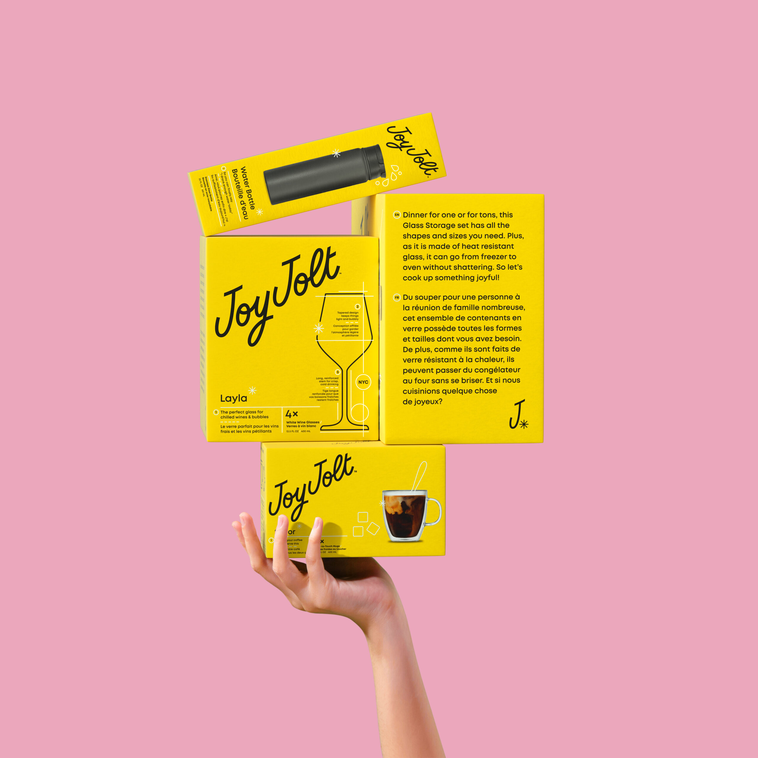
Founded in Brooklyn, the packaging’s bright color combination of taxicab yellow and black pays homage to JoyJolt’s New York City heritage while also making a powerful visual statement on the shelf.
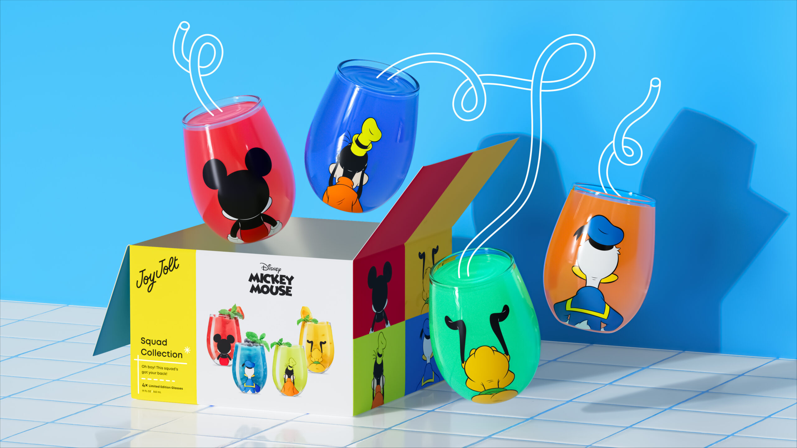
While our designers wanted to bring consistency and cohesion to the brand that would create a powerful emotional connection for consumers, they also sought to create flexibility, so design elements could span multiple categories and occasions as JoyJolt’s portfolio and licensing partnerships continue to grow and evolve.

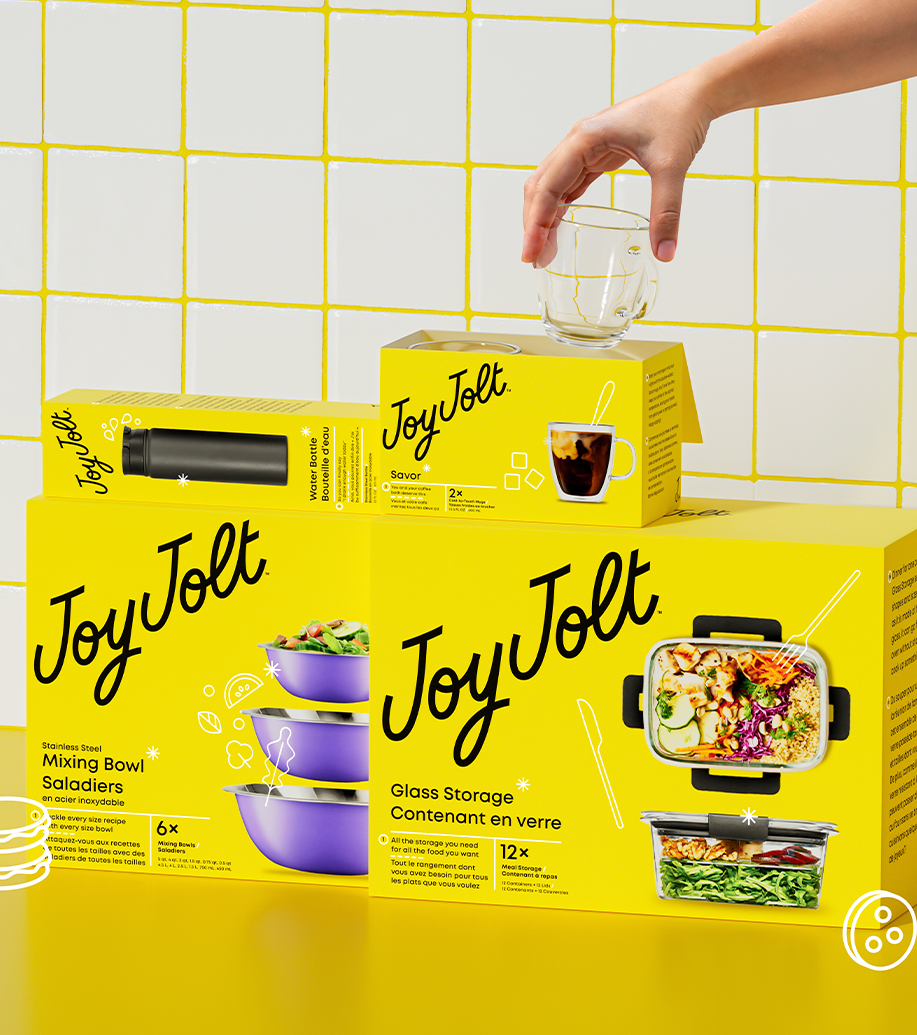
The new brand expression evokes JoyJolt’s entrepreneurial spirit, obsession with details, and high standards for quality and design. The redesign delivers an approachable yet elevated, retro yet contemporary concept that shares delight at every touchpoint. Our designers were inspired by the craftsmanship and pride in precision exhibited in an architect’s handiwork, down to the asterisk detail in the logo, which is callback to old-school blueprints.


