Thistle
Thistle
As Thistle has grown since its founding as a cold-pressed juice startup in 2013, they partnered with Pearlfisher to help reimagine brand strategy and visual identity.
Get in touch
With roots based in science and backed by experts, Thistle’s products aren’t just about eating well, they’re also about doing good. But they needed to stand out in a crowded space full of meal delivery services, smoothies, and ready-to-eat bowls by connecting to consumers’ wellness practices.
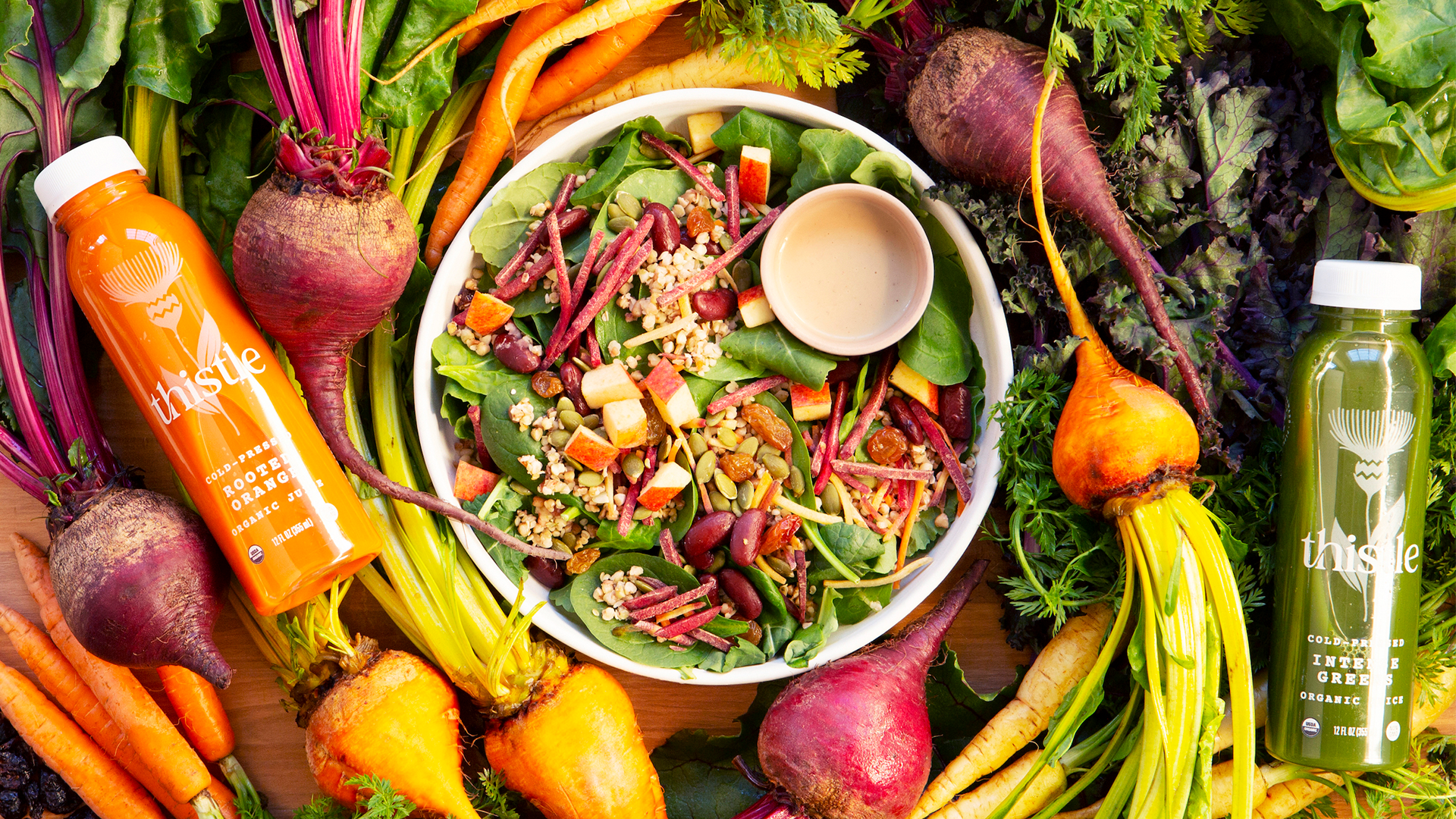
Pearlfisher’s strategists and designers focused on amplifying Thistle’s namesake—a resilient pioneer plant that sustains life around it and replenishes the earth beneath it, revitalizing the very land it grows on. They sought inspiration for the color palette directly from mother nature–finding the hero brand color in a moment of beet slices catching the afternoon sun.
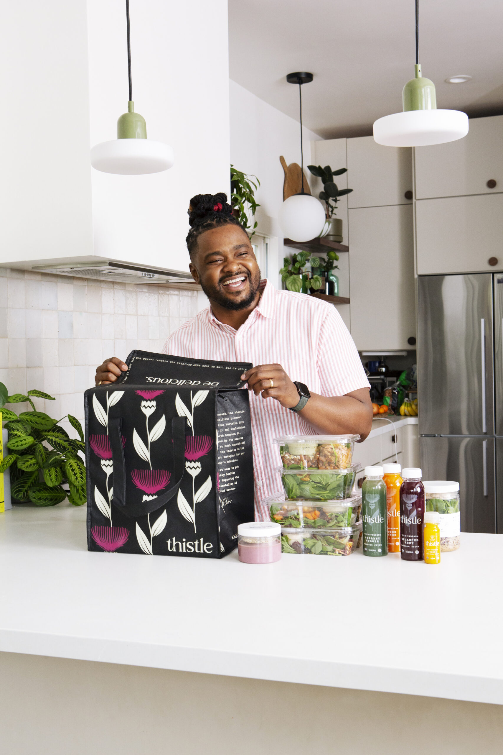
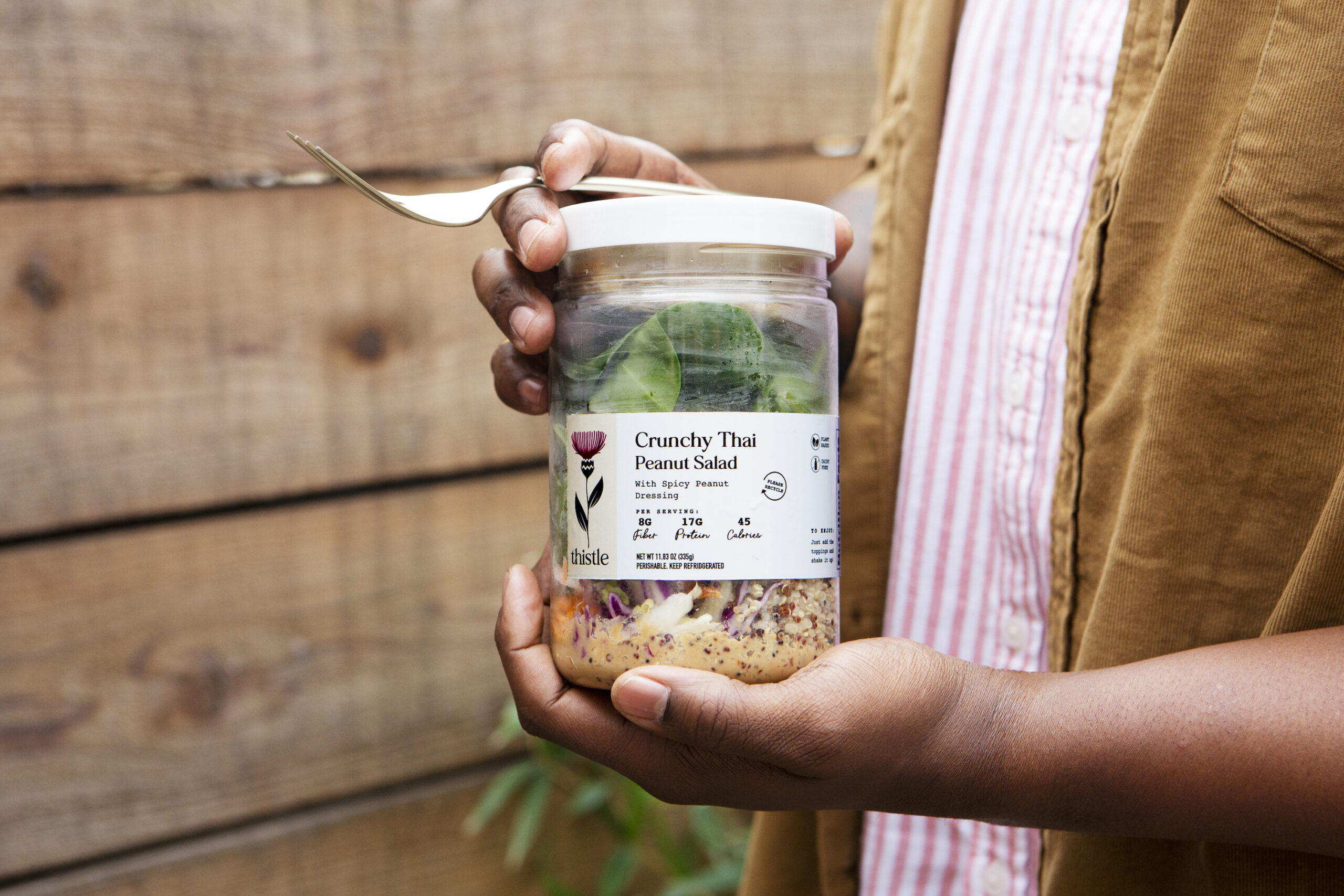
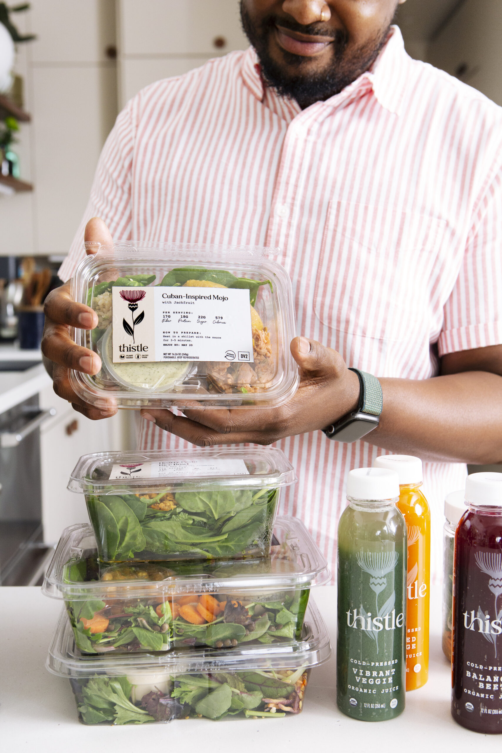
From the logo and wordmark, to tone of voice and messaging, to photography and digital brand assets, Pearlfisher’s goal for Thistle was to make plants—and the plant-based lifestyle—irresistible.
Inspired by the thistle’s amazing power to both nourish and heal, we created a brand that casts a clear vision of the Thistle of tomorrow, sharing their story clearly and proudly for employees and customers alike.