Loader

Step Back to Stand Out

Breaking away from information overload in packaging design

First impressions may mean everything, but they don’t have to say everything.

In pursuit of transparency and shelf-appeal, many brands are burying themselves in seals, claims and stickers that ironically confuse and deter shoppers instead. As consumers, we want to know everything we can about the products we’re buying and brands tend to respond with a sea of claims that flaunt quality, benefits, dietary restrictions, process, and seemingly endless reasons to believe.

To truly connect with an audience, a brand needs to present itself in a way that matches the story it’s trying to tell. Before deciding to get lost in the pages of a book, we are often sold on the story by the title and visuals on the cover. Attention grabbing, but not too revealing. It could be that the author’s name alone is trustworthy enough to prompt a purchase. In any case, the cover doesn’t give the content away – it merely draws you in.

As designers, we need to break away from the habit of overloading package designs with information. This doesn’t mean being overly precious, but rather being thoughtful and purposeful with communication. If saying too little makes us fearful of not connecting with consumers, shouldn’t we be equally as worried about saying too much? Finding the perfect balance should be the ultimate goal.

Stake your claim

Effectiveness claims have found a place in all types of consumer-packaged goods, but they have the strongest foothold amongst food and beverage brands. Regulated by trusted third parties, these claims bring brand offerings like ingredients, sourcing and process quite literally to the forefront to help shoppers make simpler decisions. Yet, they’ve created more clutter.

Some of the earliest examples of food packaging claims focused on calories and sodium content of products. Now, nearly 80 years later, organizations like the Food and Drug Administration (FDA) and the World Health Organization (WHO) help regulate the larger expanse of nutritional and functional claims commonly used to market products.

A study by Taste Tomorrow, found that positive claims (e.g. high protein, good source of calcium, lean) are more effective than negative claims (e.g. low fat, no sugar, non-GMO) in the eyes of consumers. It also shows that consumers agree when we say ‘less is more’. According to the same study, any more than two or three claims on packaging leads to consumers feeling confused or overwhelmed.

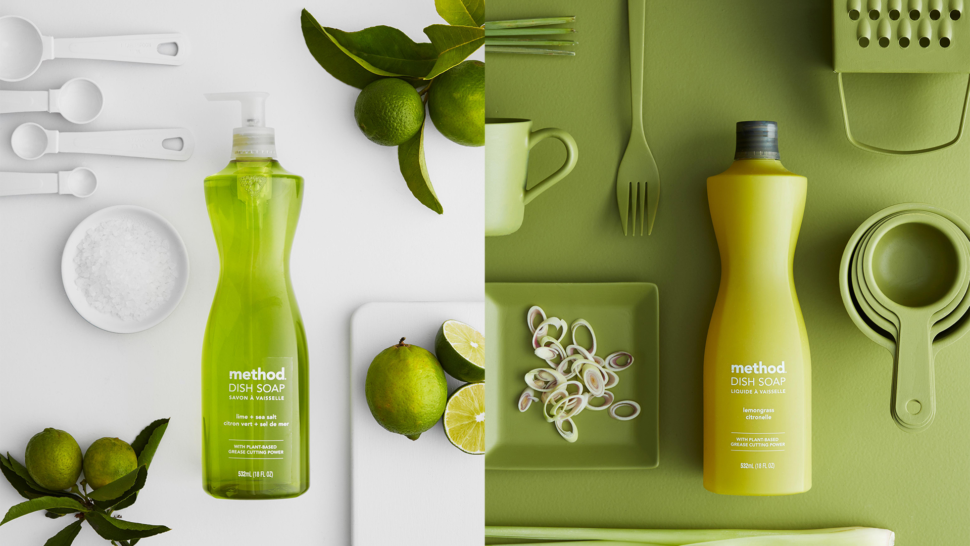
In other words, if the brand becomes buried by claims and seals, the originality and presence of its product can’t be brought to life. A brand’s unique attributes – color palette, graphic style, typography, use of illustration or photography and tone of voice – should work together to activate the core message and develop emotional connections. It may seem obvious, but prioritization must come into play when designing the front-of-pack versus the back. Otherwise, we risk designing into a sea of sameness with each brand attempting to be louder, faster and better than the next.

Ultimately, trying to say everything often amounts to saying nothing.

Create a story, not a sticker

A client recently put this into words so perfectly by saying “people today are looking for a story, not a sticker.”

Brands that look and behave like the stories they’re trying to tell are four to six times more likely to attract and retain like-minded consumers. With brand purpose being among the most motivating factors to influence purchases today (if not the most), it’s crucial that brands evoke their purpose at every touchpoint.

Examples of this continue to unfold with the “greenwashing” phenomenon throughout packaging and marketing. Green and eco-friendly packaging has become increasingly scrutinized by consumers determining whether brands are actually good for their word or if they’re cash-grabbing when they claim sustainability.

Recognizing the claim-heavy topic of sustainability, Method’s suite of soap products (shown above) stand out by stripping back. Although the household brand occasionally includes reference to their biodegradable ingredients or sustainable packaging on the pack itself, the brand’s environmental pledge is primarily explained through auxiliary platforms, like social media and the Method website. Method became a disruptor amongst consumer packaged goods for their minimalistic connection with sustainability and inspired a series of imitators. By focusing on being sustainable, rather than looking like it, Method redefines the expectation of environmentally-savvy branding and, in the process, doubles-down on what they do best –– decluttering.

We’re in the business of visual and verbal communication. It’s our duty to be as honest and thoughtful as possible – a commitment we make to clients and consumers alike. It’s on us to understand the implications of our design choices. To educate our clients and challenge them to innovate, ensuring their stories and values are true to who they are and what they stand for. And that also means holding them accountable to deliver on these claims.

In creating Colgate’s new addition to the smart electric toothbrush category, hum, we focused first on the ease and benefits the product would deliver. By elevating a distinctive tone of voice and showcasing the product itself in the brand design, we delivered a fresh, simple and sensorial approach to oral care. Calling attention to the brush’s connectivity to the personalized app stands in stark contrast to the over abundance of claims of competitors and led to a more human approach.

In order to cut through the noise on-shelf, we need to find ways to provide audiences with moments of clarity. Simply turning up the volume won’t work. We have an opportunity to simplify our brands’ opening statements to engage with our audiences on an emotional level, aligning closely with their lifestyles.

Claims don’t always need to live up front. People who care enough to find them will make the effort to look further with a simple turn of the pack.

Focus on that and trust that today’s shopper is a smarter one.

Related Articles

Pearlfisher appoints its first Global CEO
News

Pearlfisher appoints its first Global CEO

Brand-building for long term business success, the 3-year strategic blueprint for C-Suite.
Perspectives

Brand-building for long term business success, the 3-year strategic

Pearlfisher London: Calling creatives for Fresh Pearls 2024 Competition
News

Pearlfisher London: Calling creatives for Fresh Pearls 2024 Competition

Building an Iconic Brand in 2024
News

Building an Iconic Brand in 2024

Sophie Maxwell’s Article on The Future of Luxury Featured in Fortune
News

Sophie Maxwell’s Article on The Future of Luxury Featured

Pearlfisher appoints its first Global CEO
News

Pearlfisher appoints its first Global CEO

Brand-building for long term business success, the 3-year strategic blueprint for C-Suite.
Perspectives

Brand-building for long term business success, the 3-year strategic

Pearlfisher London: Calling creatives for Fresh Pearls 2024 Competition
News

Pearlfisher London: Calling creatives for Fresh Pearls 2024 Competition

Building an Iconic Brand in 2024
News

Building an Iconic Brand in 2024

Sophie Maxwell’s Article on The Future of Luxury Featured in Fortune
News

Sophie Maxwell’s Article on The Future of Luxury Featured