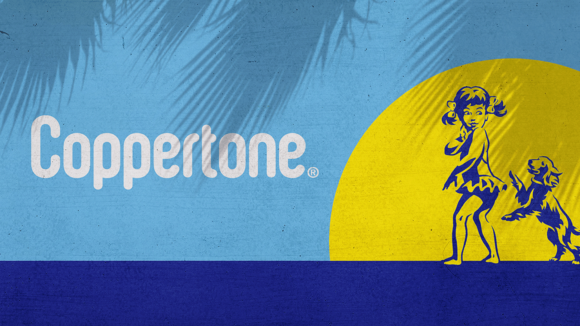
Coppertone
How do we seize the sun and create a bright new future?
The first suncare brand launched in the US and still America's most trusted, Beiersdorf's iconic sunscreen, Coppertone, was blending into an evolving suncare category bursting with both SPF numbers and emerging 'beauty sun' brands.
Get in touch
Our team was tasked with reinstating its iconic status with a new visual identity system and brand architecture that would build on Coppertone’s legacy of protection and, once again, cement its place as a category leader.
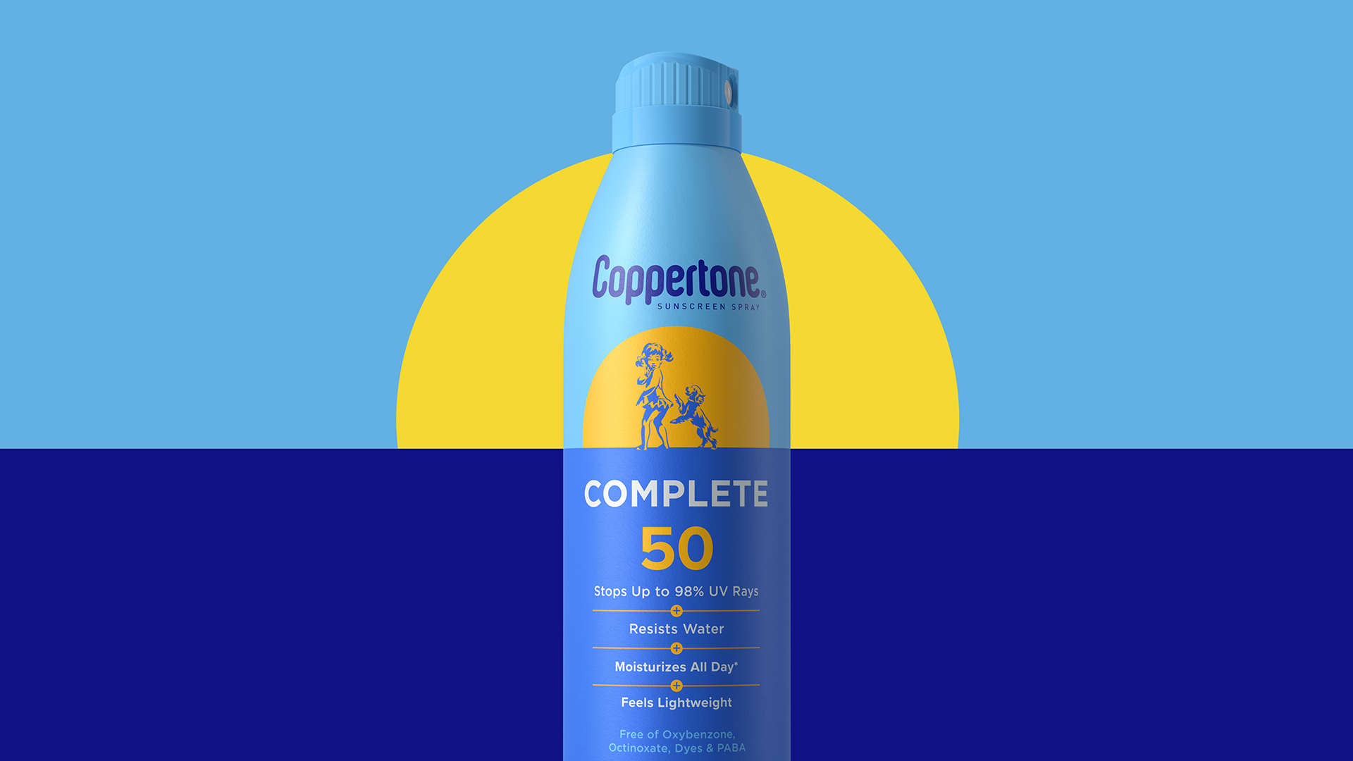
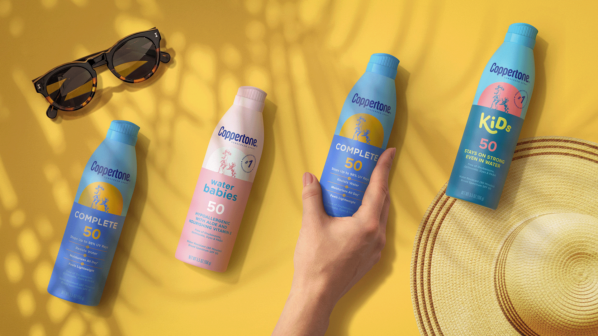
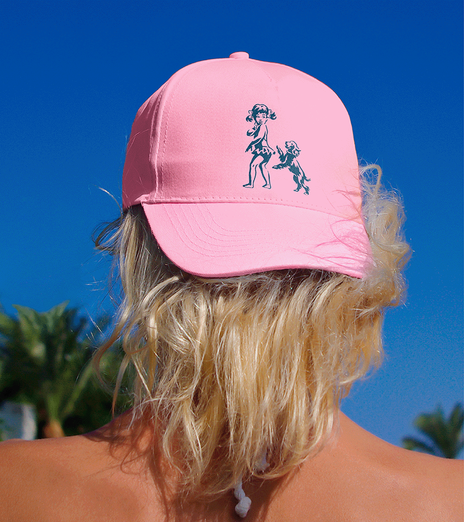
With a design solution uniting each product literally under the sun, utilising the horizon line to represent the Coppertone brand. We looked back at Coppertone in its heyday, taking inspiration from its distinctive equities, such as Little Miss Coppertone, who now takes centre-stage as a more contemporary, inclusive and playful illustration. This includes packaging where Little Miss Coppertone flexes across all sub-brands as she becomes central to the brand storytelling – and mission to ‘seize the sun’ – across packaging, brand world and digital communications.


Related projects