Filter by:
Pioneering non-alcoholic spirits
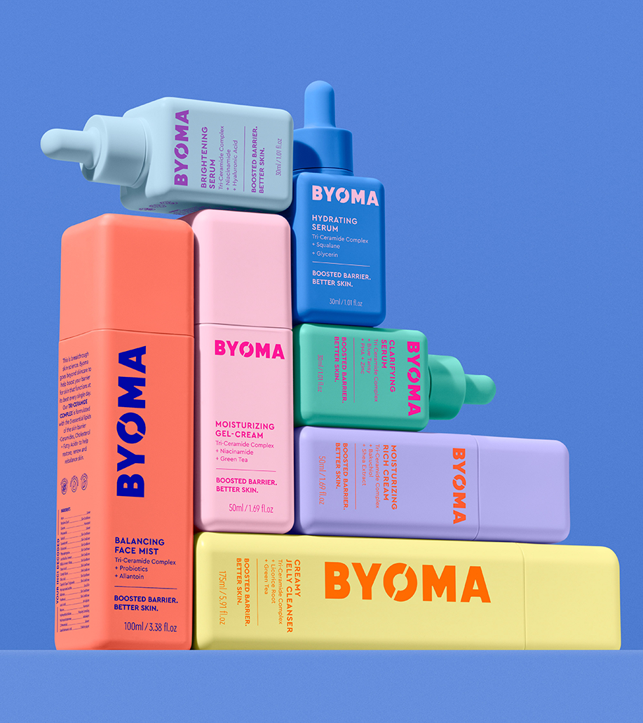
Breaking down beauty barriers
Recapturing iconic status and equity
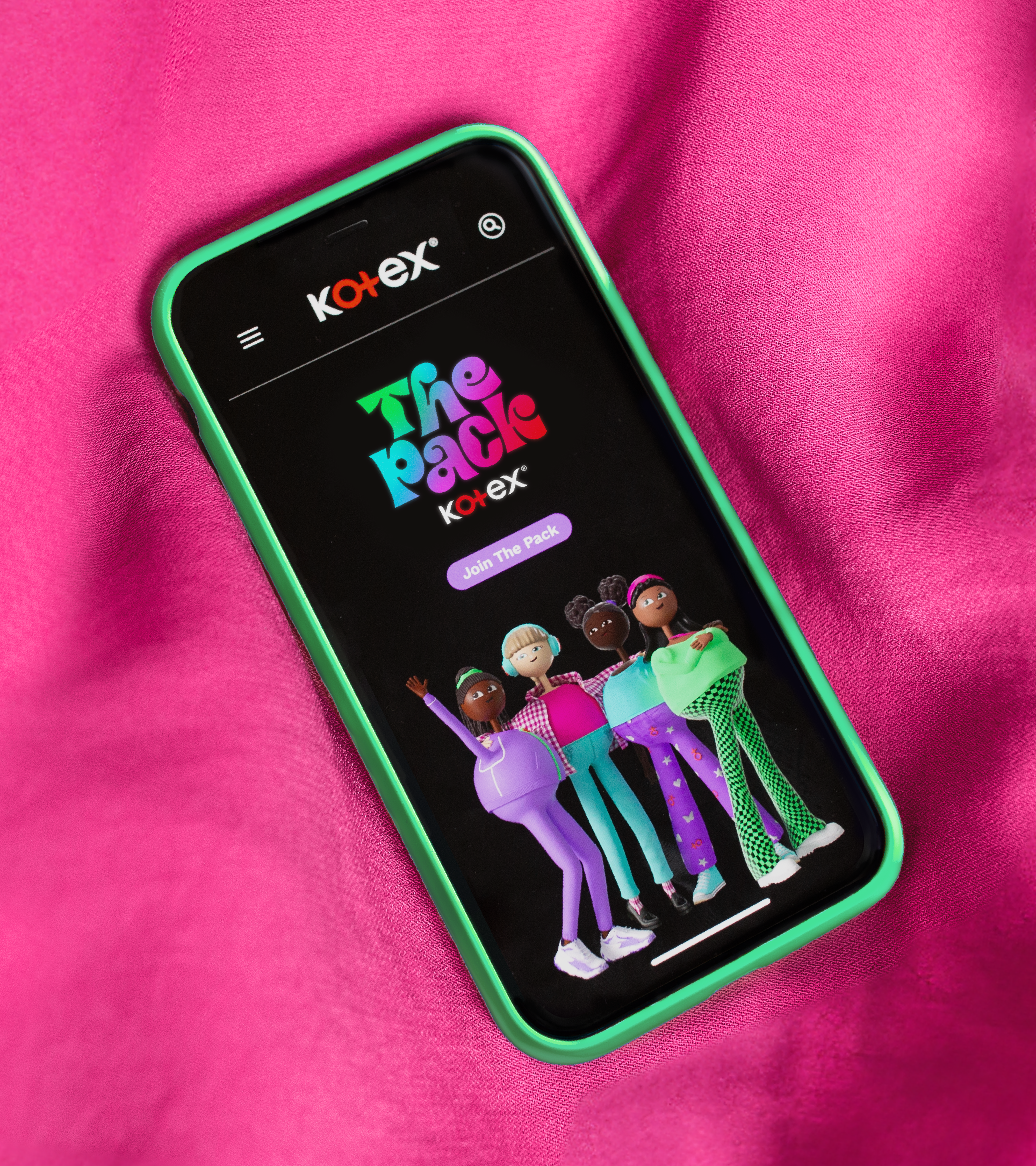
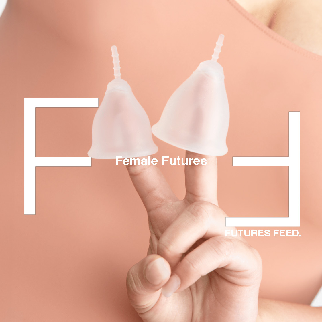
Reimagining menstrual health education
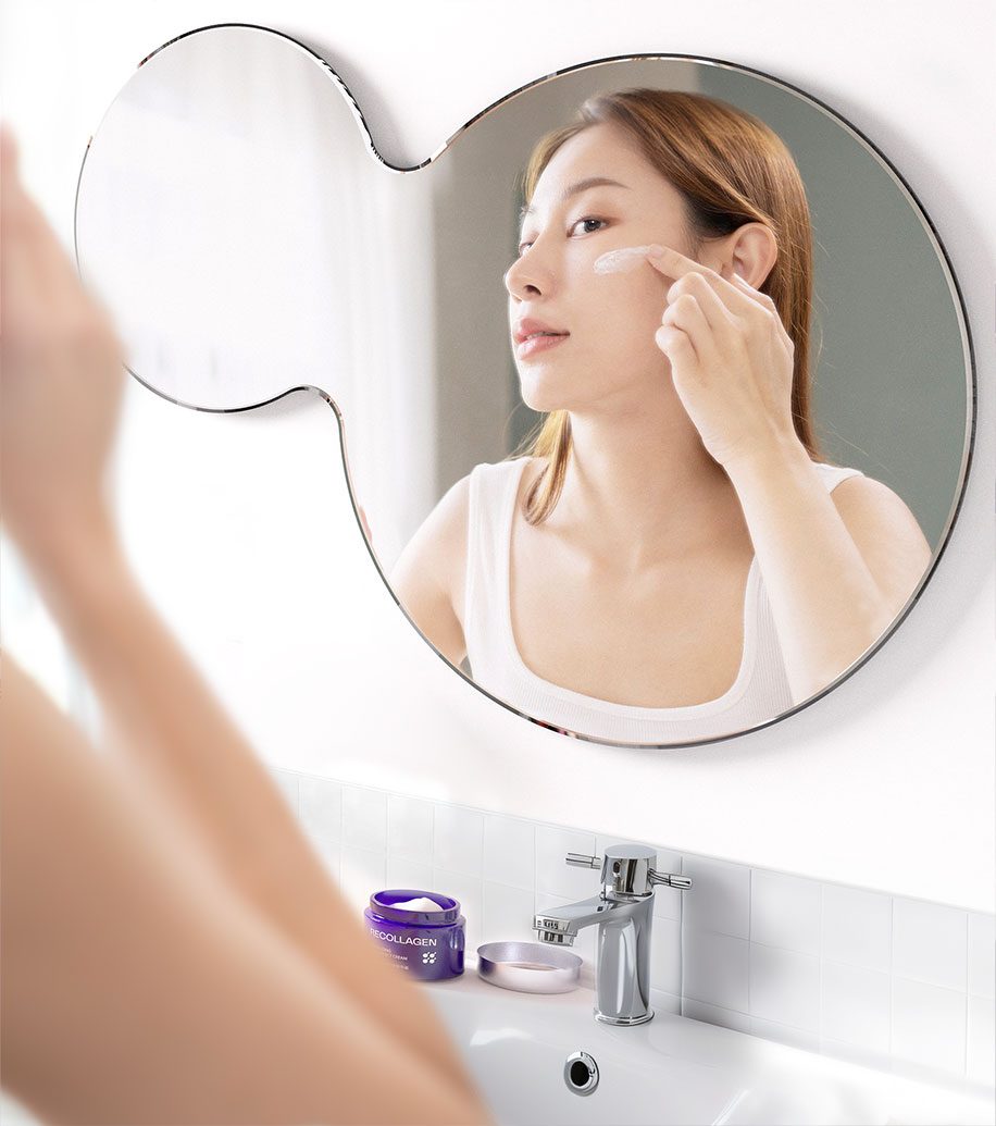
From medical-grade to consumer-facing
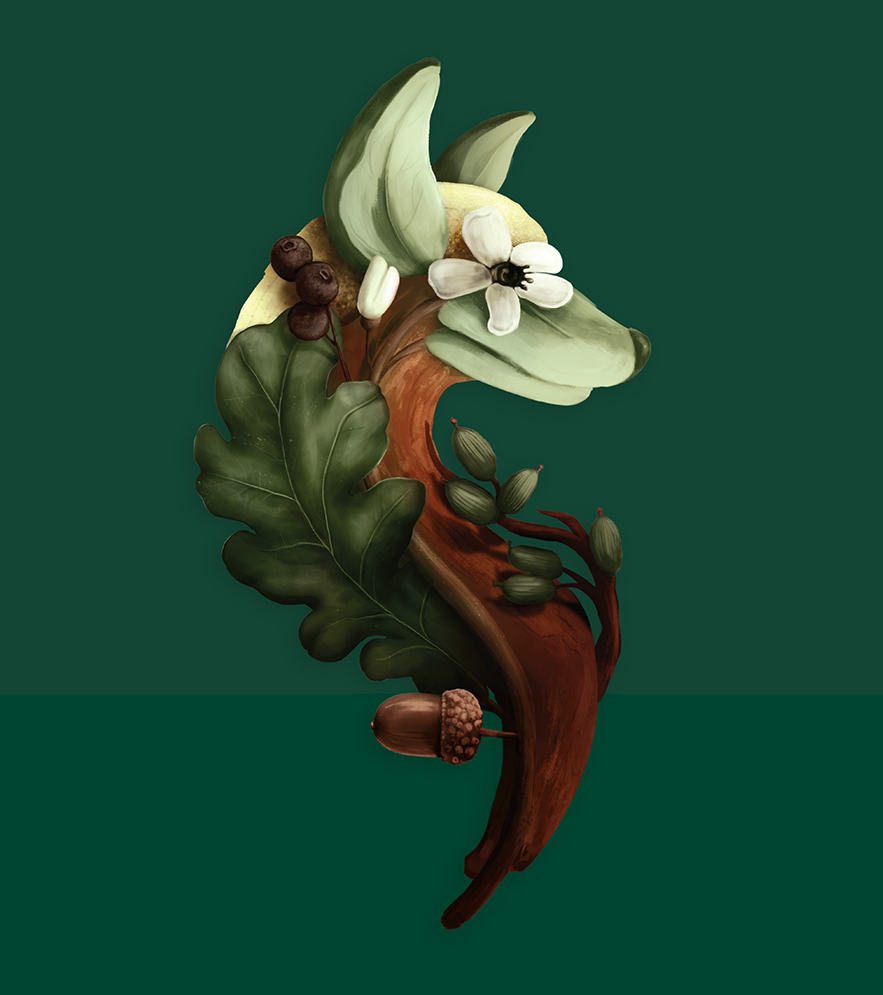
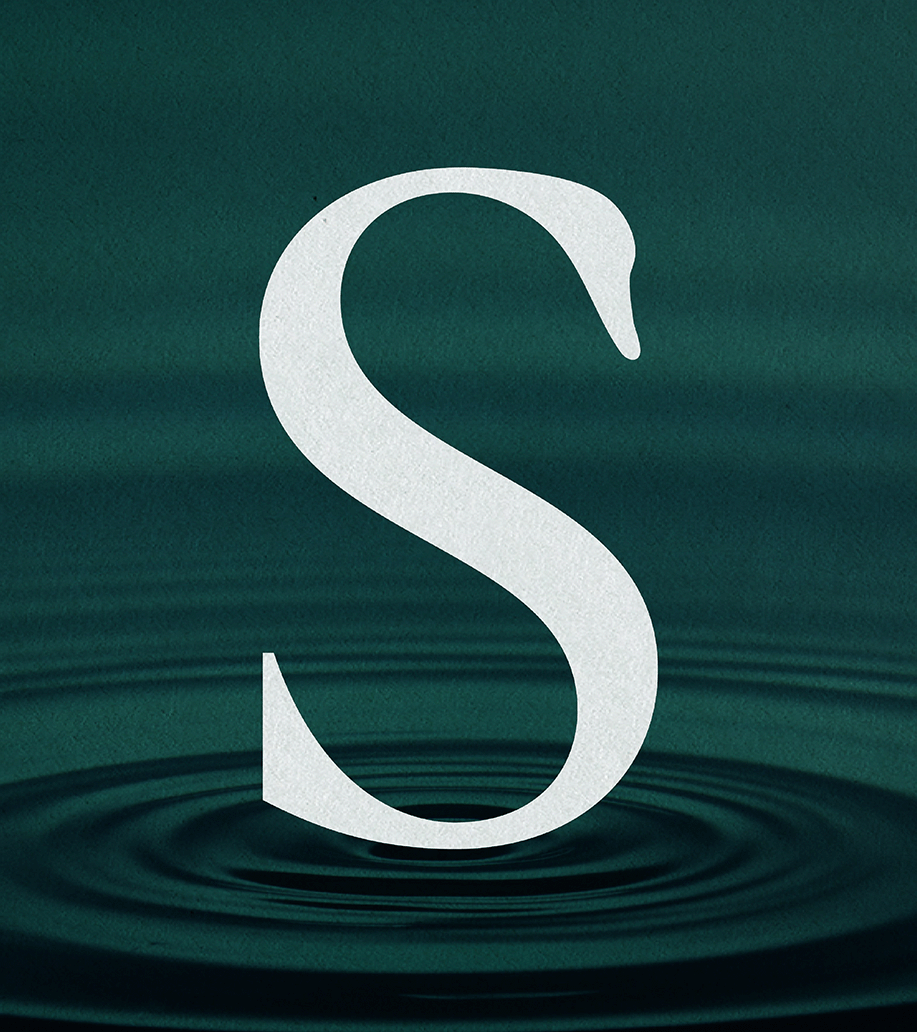
Treasuring story and symbolism
Reshaping societal perceptions
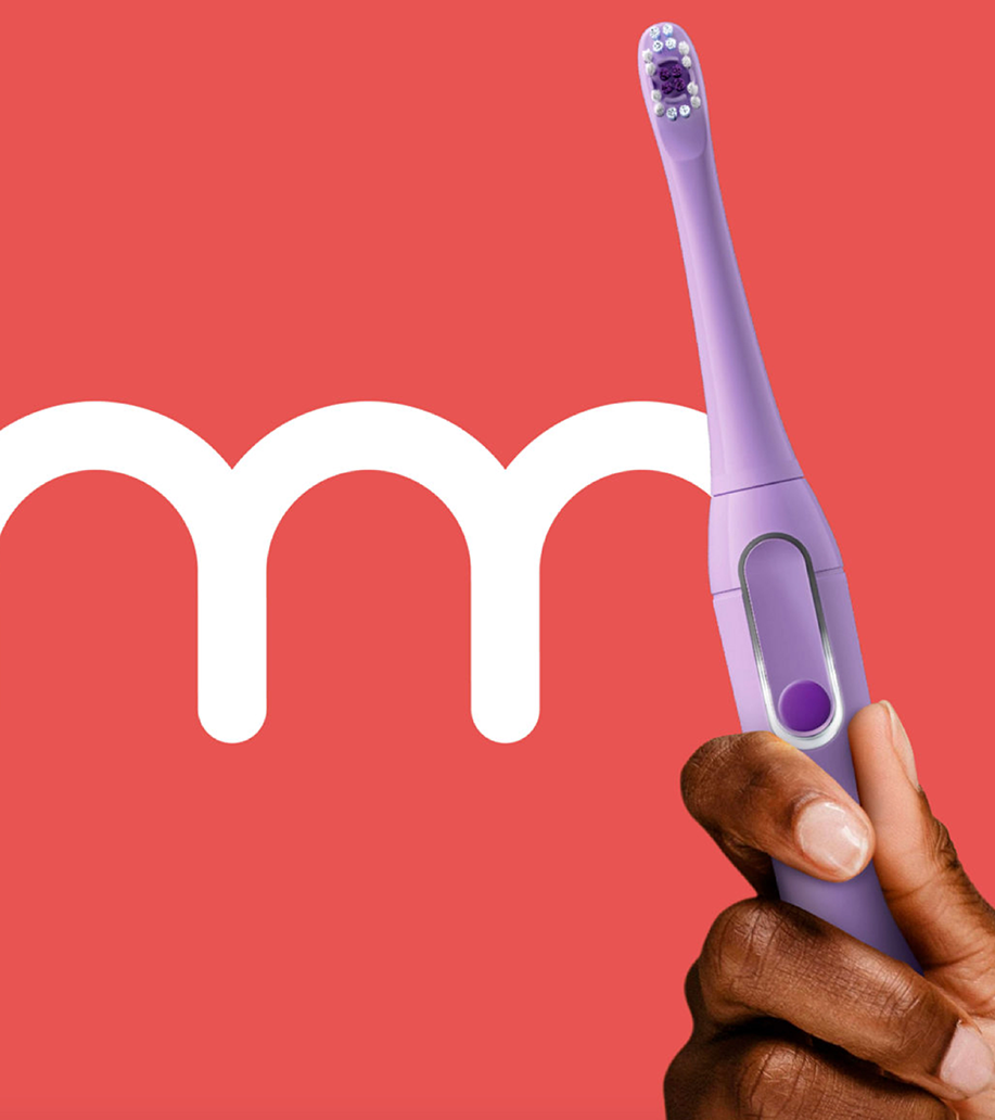
Translating technology into experiences
Transforming modern motherhood
Futures Feed: Female Futures
Pearlfisher: Our journey toward B Corp certification
Pearlfisher London Appoints Chloé Templeman as Executive Creative Director
Brand-building for long term business success, the 3-year strategic
Pearlfisher appoints its first Global CEO
Sophie Maxwell’s Article on The Future of Luxury Featured
Building an Iconic Brand in 2024