Filter by:
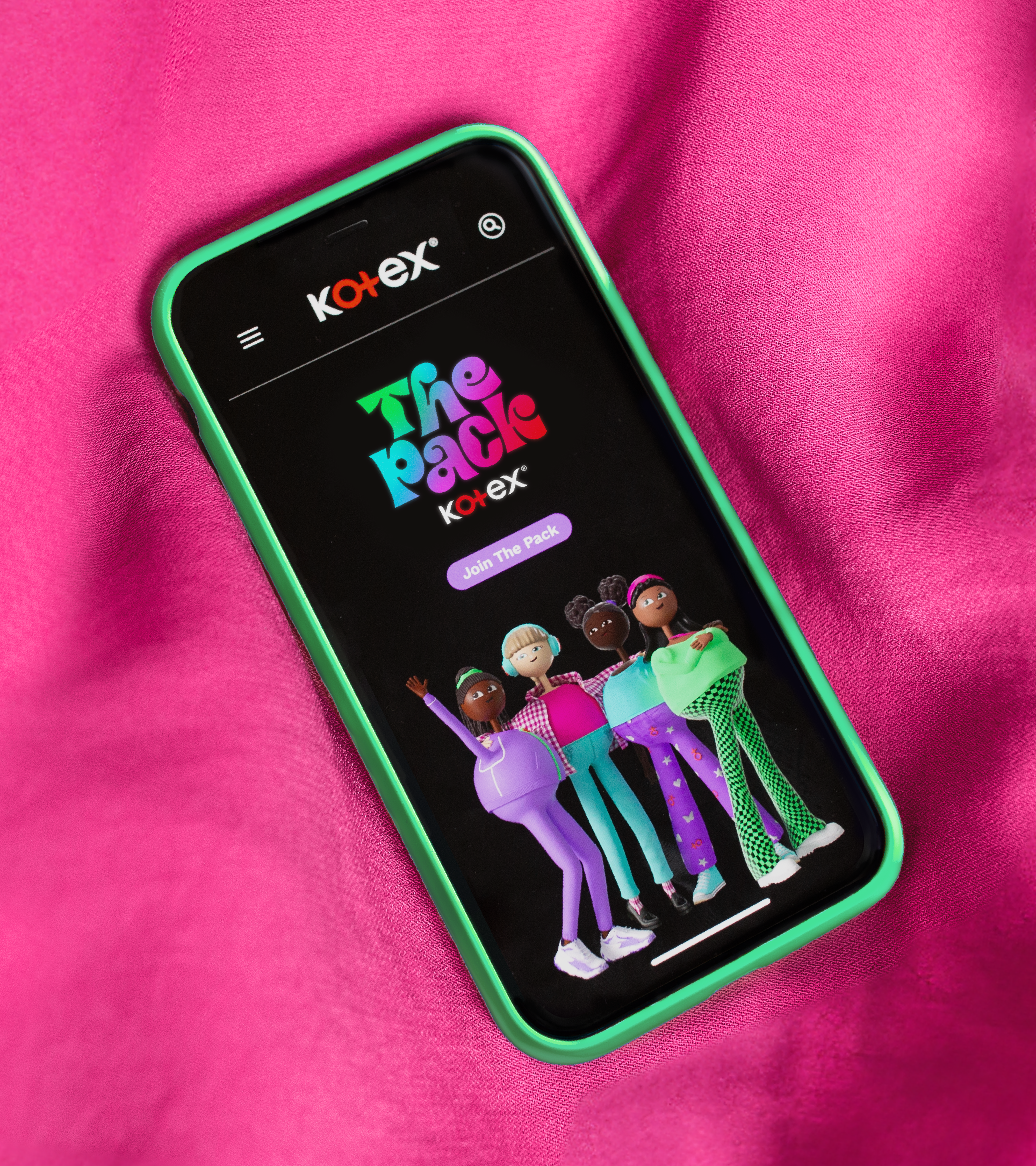
Reimagining menstrual health education
Reshaping societal perceptions
Treasuring story and symbolism
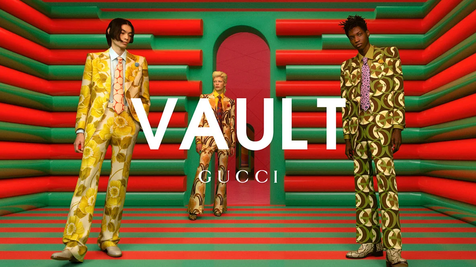
Recapturing iconic status and equity
Breaking down beauty barriers
Translating technology into experiences
Transforming modern motherhood
Reasserting leadership and expertise
Creating a wave of change
Pearlfisher appoints its first Global CEO
Pearlfisher: Our journey toward B Corp certification
Pearlfisher London Appoints Chloé Templeman as Executive Creative Director
Brand-building for long term business success, the 3-year strategic
Sophie Maxwell’s Article on The Future of Luxury Featured
Building an Iconic Brand in 2024