Kahlúa
How do we stir up a dark and heavy world with a boost of playfulness?
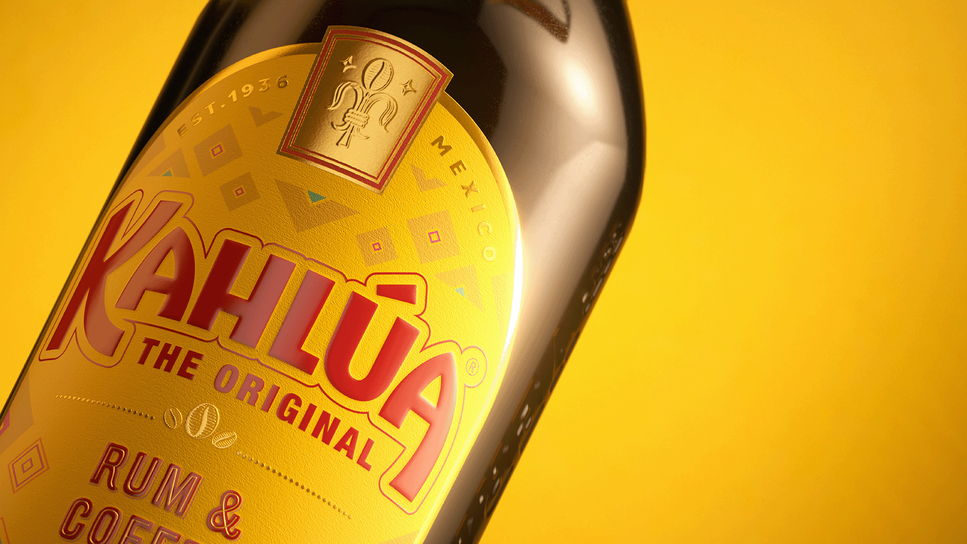
The world's number one coffee liqueur, Kahlúa, is renowned for its unmistakably delicious flavour and Mexican spirit. While Kahlúa had recently undergone a rebrand, it hadn’t seen as much success in the US – its biggest market – as it had in the UK. After using separate identities across UK and US markets, Kahlúa wanted to bring character back to its logotype and strike a balance between communicating its heritage and its coffee credentials.
Get in touch
To devise one harmonious design for a global market, we partnered with their team for a rebrand – encompassing identity, strategic vision, brand and packaging design – that was the perfect balance of 3 essential ingredients: Kahlúa’s iconic Mexican heritage and coffee flavour – and the brand’s playful personality.
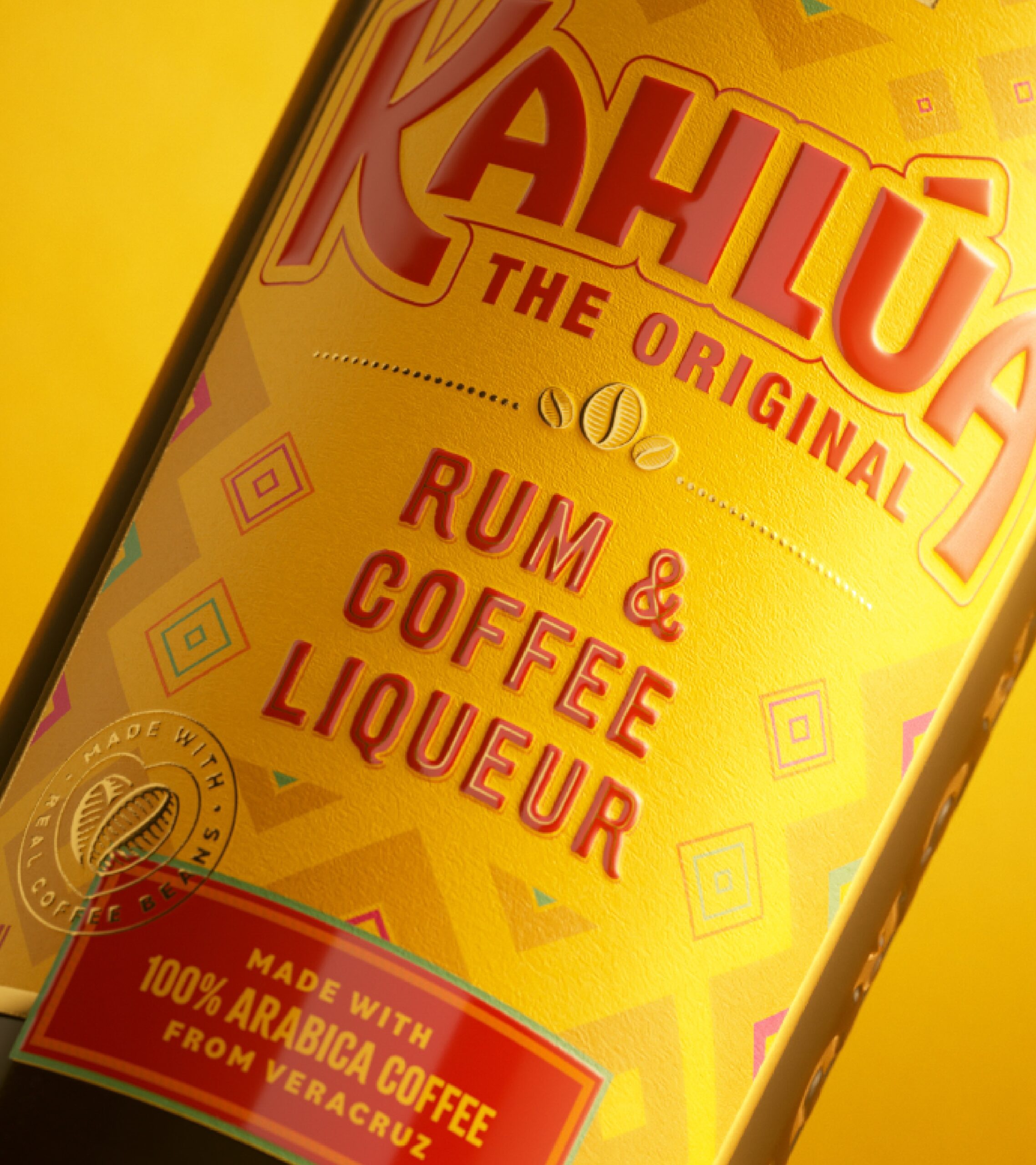
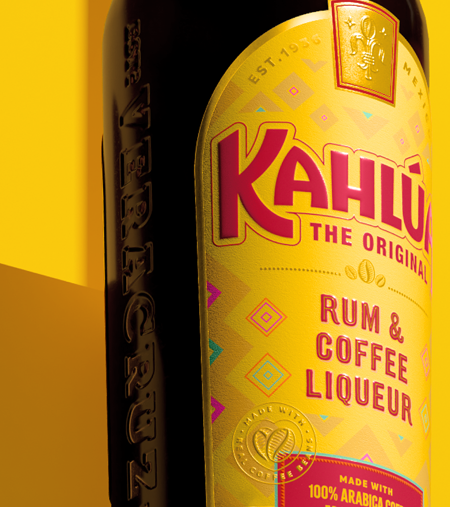
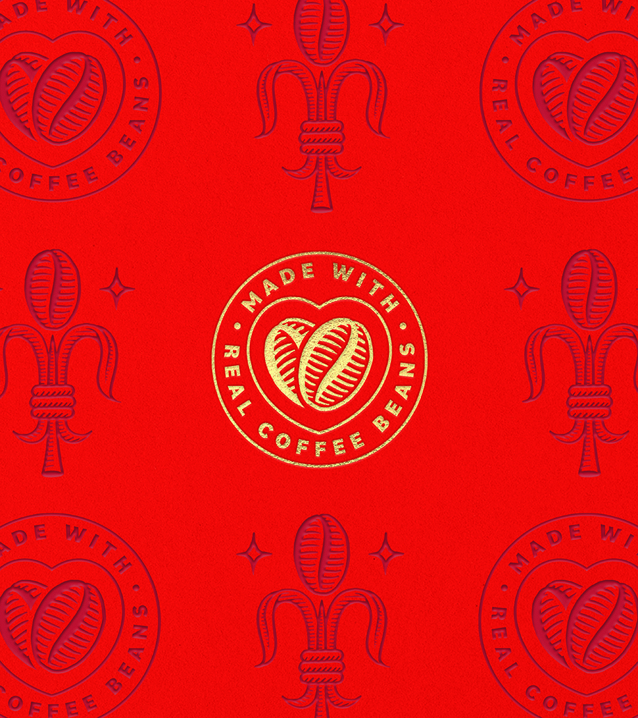
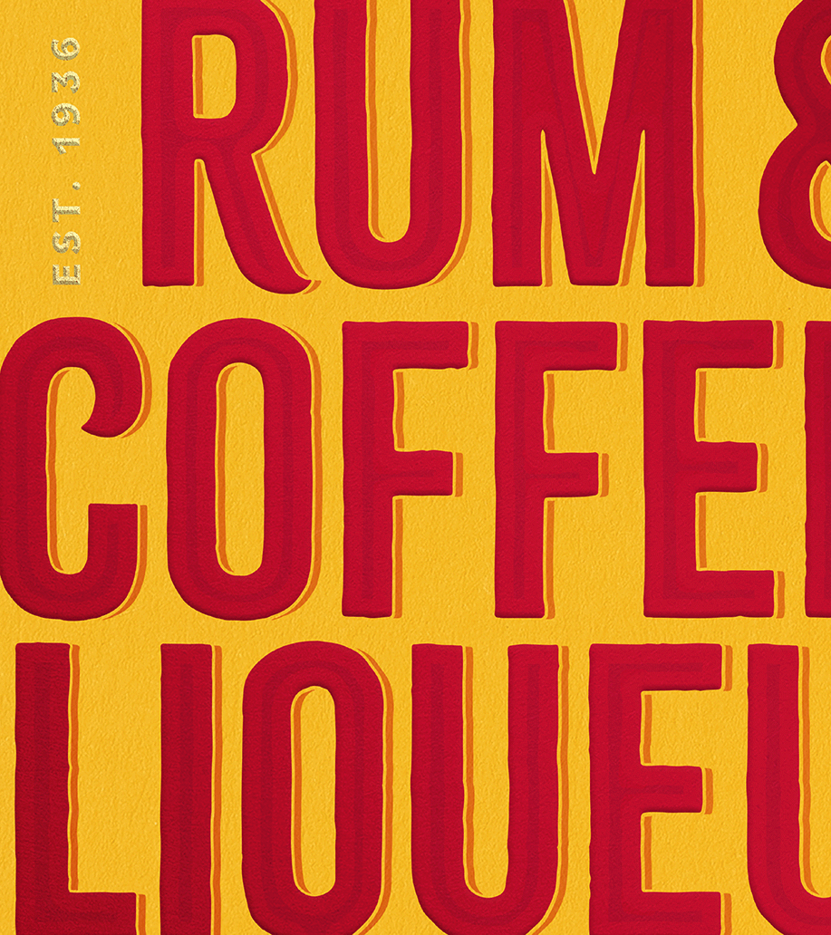
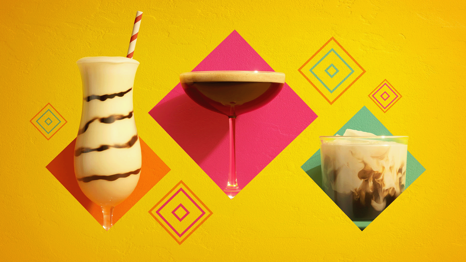
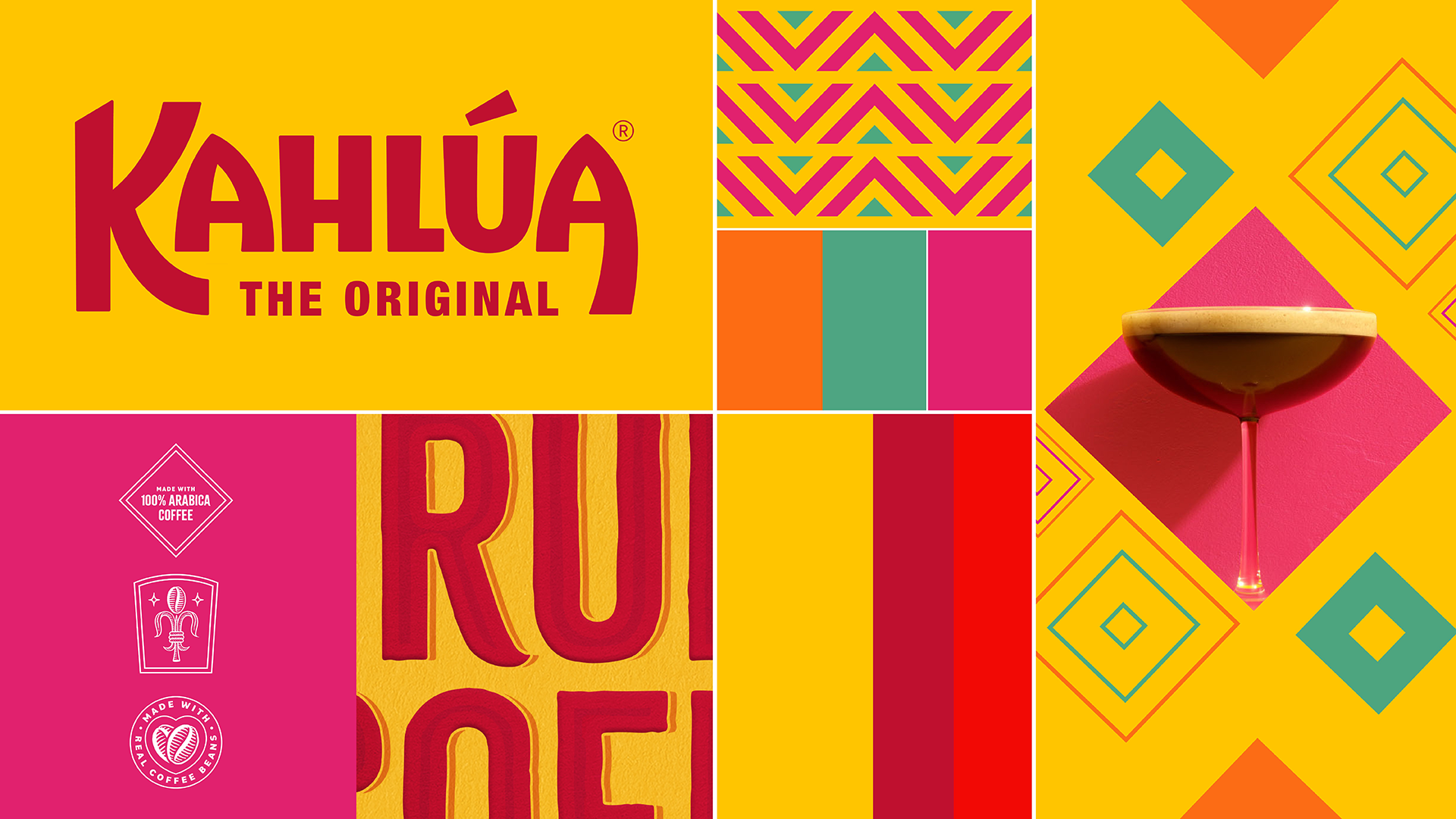
Starting with its signature arch label as the canvas, the bold and confident new logotype of Kahlúa’s striking red wordmark has evolved to feel more playful, and ‘The Original’ lockup ensures shelf stand-out in a traditionally dark category. Improved hierarchy and layout of messaging proudly highlight the brand’s expertise and premium status. Honouring Kahlúa’s legacy and drawing inspiration from its origins, colours influenced by modern Mexico and lively geometric patterns enrich Kahlúa’s brand transformation.
Related projects