PG Tips
How do we bring back our depth, richness and character without losing our simplicity?
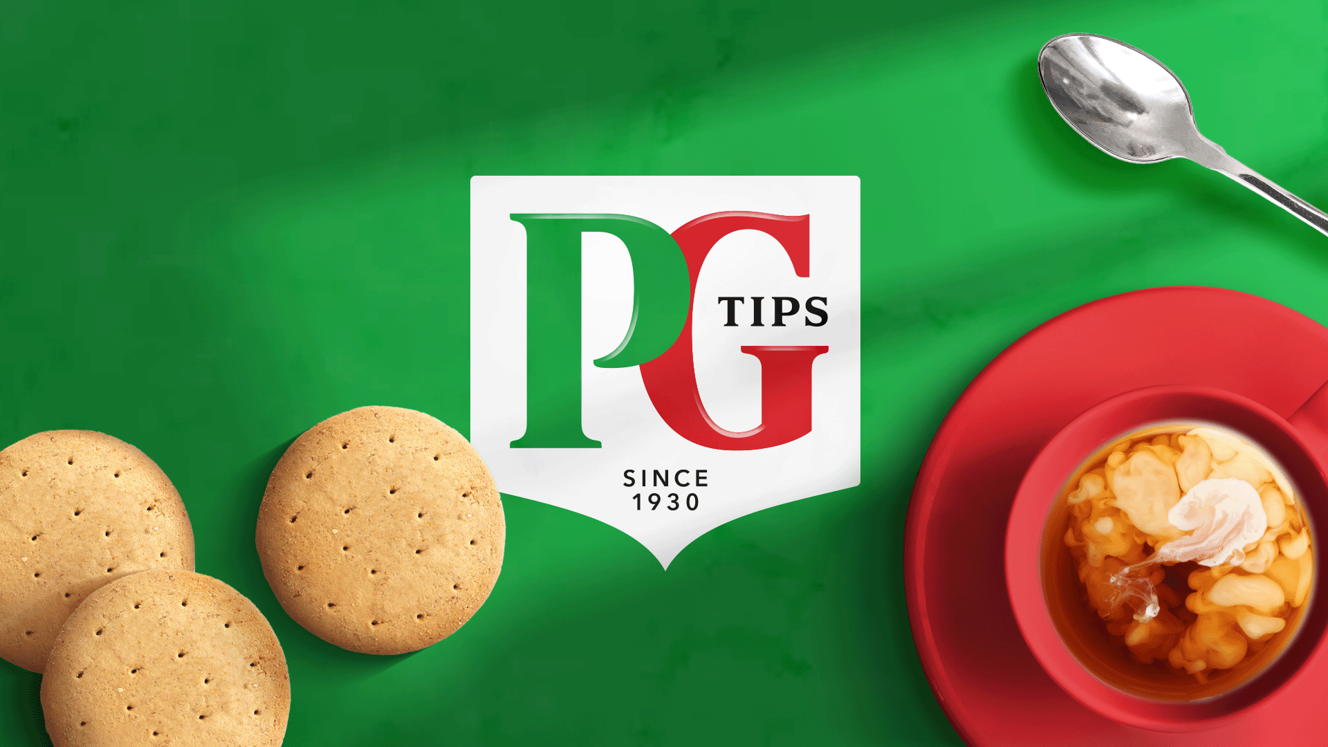
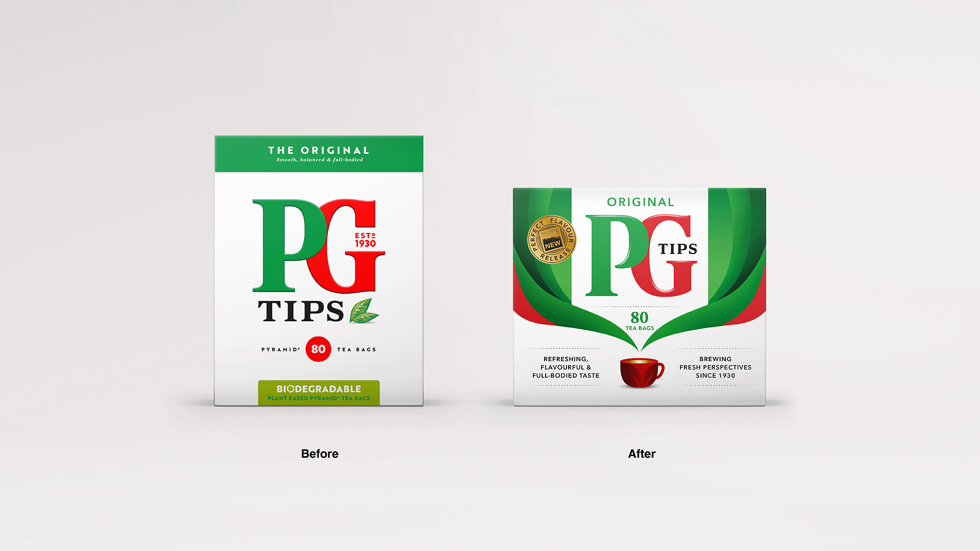
The name PG Tips needs no introduction. Part of the world's largest tea company – Lipton Teas & Infusions, the brand has been a UK household favourite for decades. To better capture the special moment that PG Tips represents and move away from its previous, overly simplistic design lacking character and depth, we transformed its visual identity and design.
Get in touch
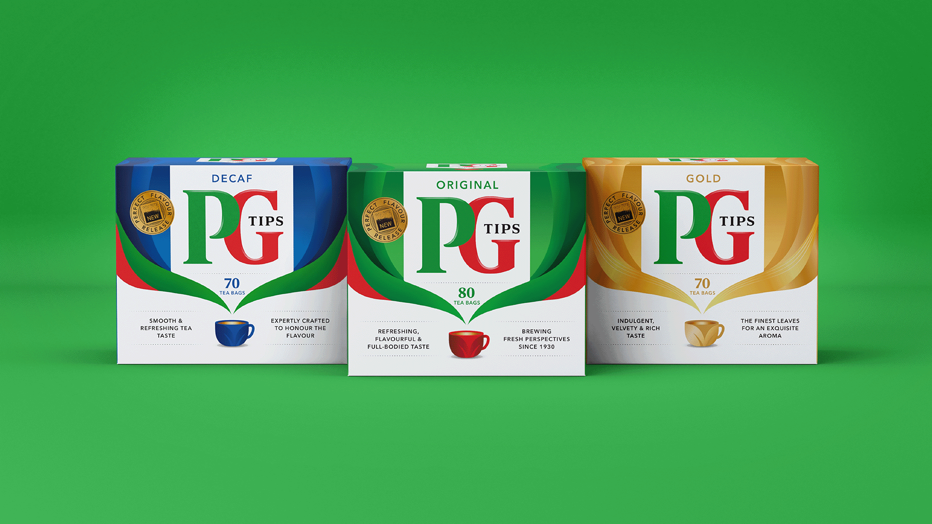
Coinciding with the launch of its new and improved square teabag, PG Tips’ new look bursts to life with vibrant aroma swirls, used as a visual device and a storytelling element. The idea was to give PG Tips a taste and refreshment narrative, along with the emotional benefits of tea. These aroma swirls gracefully encircle the product, symbolising the uplifting fragrance and flavour that await inside every PG Tips cup.
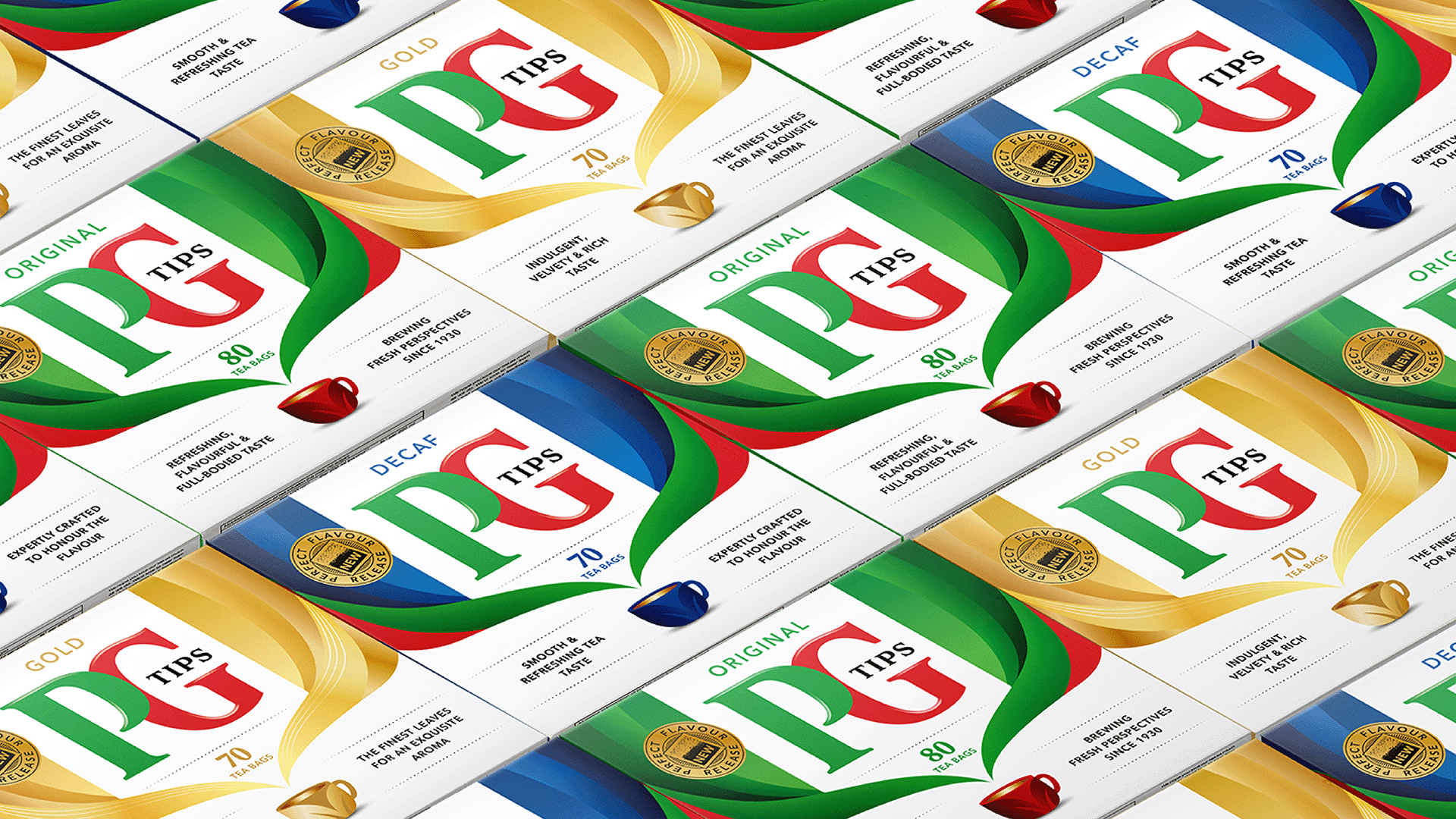
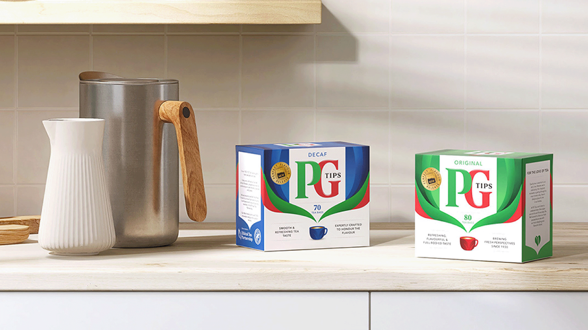
Retaining its signature red and green hues – the refreshed colour palette is set against a white canvas, artfully evoking the depth and richness of its signature tea. Subtle highlights have been added to the logo, imbuing it with a touch of premium character. The new design conveys PG Tips’ expertise and gold-standard taste in tea.

Related projects